Discovery and reframing
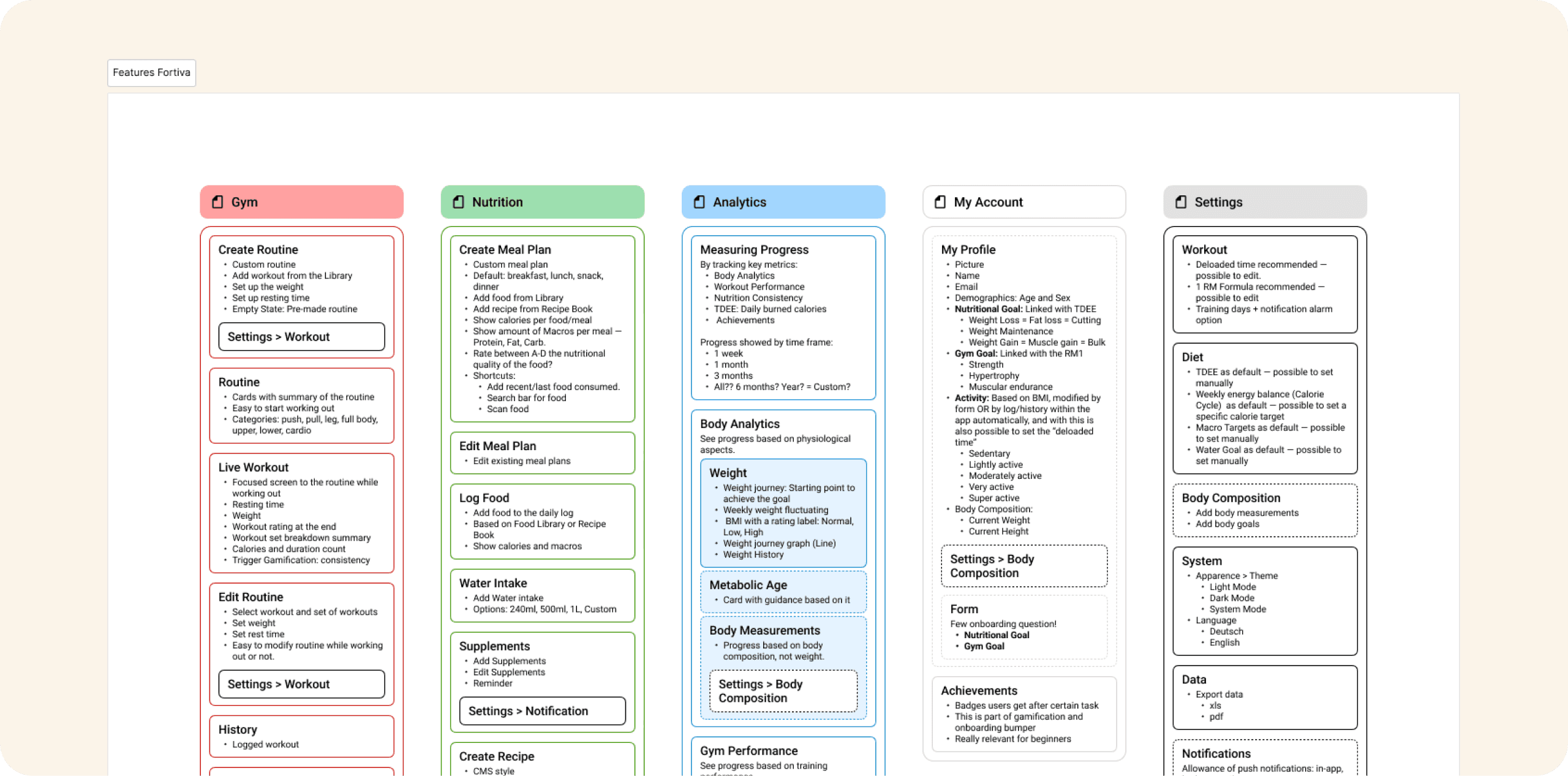
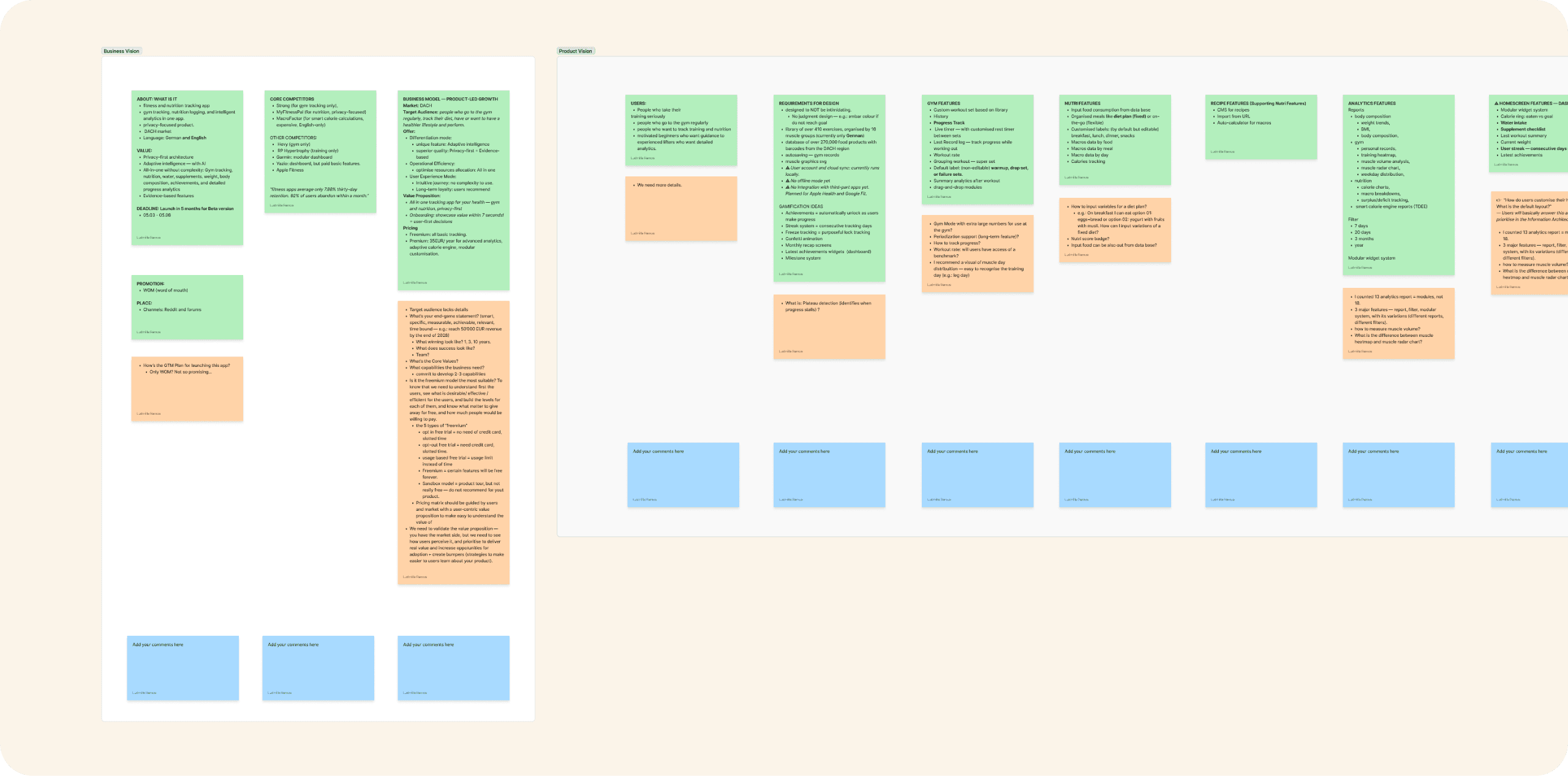
I started by clearing the fog around the product itself. The 110 items that were called features were reclassified into 23 real features with user value, enabling me to understand the project's complexity and prioritise. From there, I could start building the backbone of the app's architecture.
With no users to test yet, I built the evidence base without them: an AI-assisted mining of competitor feedback turned into proto-personas, an empathy map, a JTBD analysis, and a customer journey, all marked for validation. Yet, with the insights we got, it was enough to deprioritise tier 4, focus on 3 segments, and have plenty of context that would change the initial product direction.
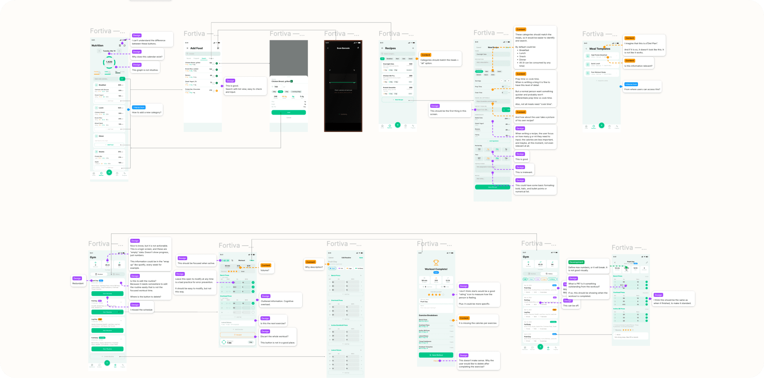
I created a research gap analysis showing where the market signal ended and where validated user insights were needed to start. I also audited the existing prototype and flagged flaws in design, content, and logic that required redesign.
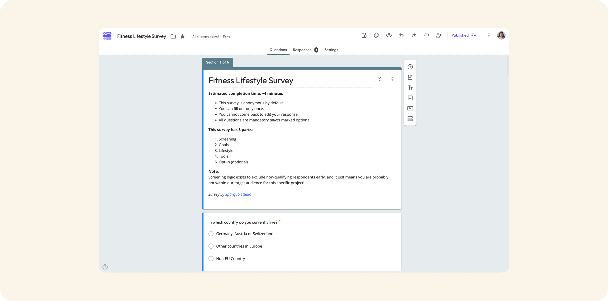
To validate everything in the most affordable way and with as little bias as possible, I designed a research funnel: a broad survey to capture journey-level signal across the four initial tiers, with qualifying questions and an opt-in for interviews and usability testing that would recruit candidates from respondents who showed the most compatibility with our segments.
Attitudinal insights would come from the interviews to provide us enough context and validate assumptions. Behavioural validation would come later, in Phase 2, through usability testing, to for an in-depth understanding of usability and validate hypotheses in practice.
Triangulation was the focus of this phase.
Four sources of evidence would be aligned: the founder's competitive analysis, my AI-assisted secondary research on user feedback from competing apps, the heuristic audit of the existing prototype, and the survey and interview output.
By the end of this phase, the founder had something he didn't have before: a working hypothesis of who the product was for, the core values that needed to land first, and the key gaps blocking a better user experience.
Key findings
User segmentation exposed a launch risk
The app was too technical for beginners, and the users best-fit for core features had low tolerance for errors. The direction was to deprioritise core features at launch to protect reputation and readapt for a more intuitive journey.
Free-to-paid needed a learning pathway, not just a paywall
Beginners had a knowledge gap, and no onboarding addressed. Gamification existed but carried no real value. All were missed lever for free-tier motivation and paid-tier progression. The direction was to create onboarding bumpers and redesign gamification as the spine of the free-to-paid journey.
"Freemium" was being mistaken for PLG
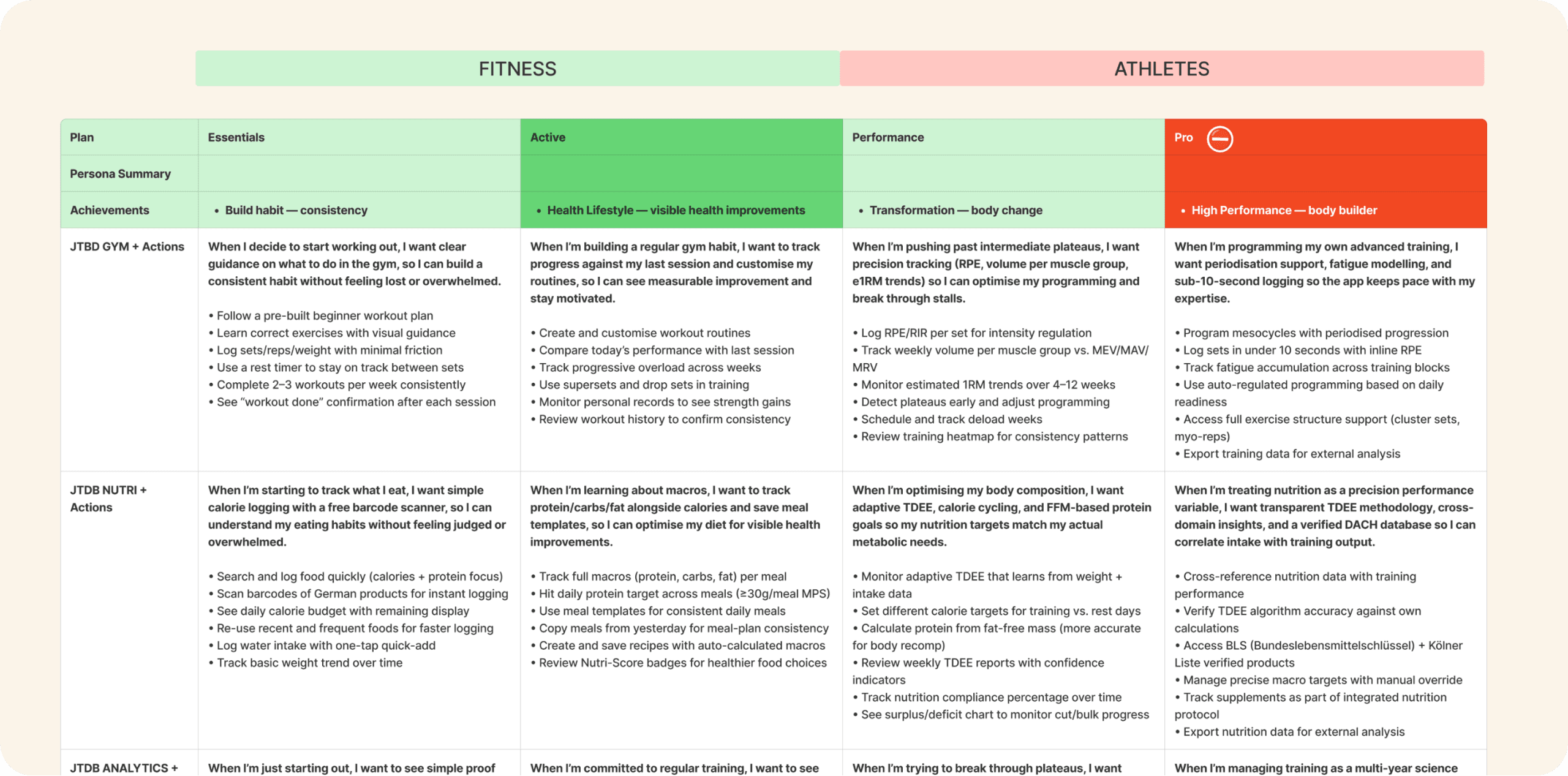
The founder's pricing intuition was sound, but freemium is not the same as a PLG strategy — I wrote about this exact trap. I mapped features to tiers along the customer journey, so paying felt like a natural step in the user's commitment to fitness, not just a paywall with bloated features.
Modular dashboards sound user-centric, but often aren't
Letting users choose graphs and toggle show cards hides the real job: surfacing the right information in the right context. I redirected the dashboard to contextual relevance based on insights from the product discovery with testing.
The app was intuitive only to the founder
Screens were bloated with actions and data, creating cognitive overload. The information architecture didn't reflect how users actually progressed. I flagged IA restructure as a prerequisite for any further feature work.
The final decision
All these insights enabled the founder to have a wider view of the product and strategic moves to increase the likelihood of product adoption. And it came at a price: a lot of friction that made the founder rethink moving forward with the product at this moment. As a strategic move, he decided to pause.
Roadmap
What would be next?
The deliverables still hold, and the vision is intact.
Whenever the founder picks it back up, there's clarity in the journey and a long-term direction to build from.
The plan covered five workstreams:
Review the architecture and rebuild the user flows on top of validated evidence from Phase 1.
Redesign the app using shadcn (Tailwind + Radix) — a stack that lets the founder vibe-code UI iterations without breaking the design system.
Test the new prototype with selected participants from the survey funnel for usability testing — the first behavioural signal we'd have on real users.
Validate the pricing. A subscription model with a freemium base, with price-point questions embedded in the pre-usability interview so willingness-to-pay was tested before launch.
Set up the GTM foundations: a website with sharp DACH-native positioning, one gym chain partnership to promote the app at a discount, and word-of-mouth seeding in DACH-specific forums.
Conditional launch:
Going live only if the evidence held 90% task completion across the three core flows during usability testing, one signed gym partnership, and no fundamental misread of the 3-tier segmentation surfacing in interviews.
What would be later?
The focus would be on the market penetration strategy, so adoption metrics and a full understanding of users' actions within the app would be crucial.
Measure everything that signals whether people are seeing the product and wanting it: feature performance, churn rate, time to value, aha moments, activation rate, stickiness, retention curves. The full product metrics stack. This would define the next steps for growth.
And at this stage, a lot of the product discovery insights would have more robust data to be validated, and a segmentation well defined to better position the product in the market, and providing signals that hold people finding value, coming back, using it deeply — we get the first real insights toward product-market fit.
The market context
The DACH fitness app market is worth around €2.7 billion in 2026 and growing at 27% a year.
Fortiva targets a specific niche within it: committed lifters who want a privacy-first, German-language tool. It works out to roughly €200 million in addressable revenue over three years.
The one-year revenue forecast in the plan was around €160K in annual revenue (ARR) used a directional pricing model that still needed to be validated through the Phase 1 and Phase 2 during interviews — a directional testing: was the plan ambitious enough to matter, and realistic enough to start?
The sizing said the market was large enough to support a niche business. The forecast demonstrated that the plan, once validated, could land somewhere worth going.
Key takeaway
90–95% of pre-seed startups never reach Series A. And guess why? The killer is rarely technology. More often, it's the absence of customer orientation and the inability to seek the right information at the right time. Fortiva was a clear example. AI just made it harder to see in the first place.
1. AI collapses the startup ladder and linear processes.
AI has been speeding up development while leaving the backbone strategy behind.
From pre-seed to Series B, each stage has a job: making the idea plausible, then feasible, then desirable. MVPs usually arrive in Seed alongside the business model. With Fortiva a part of the MVP and business model setup, we were still building hypotheses, researching, and shaping a strategic position to validate problem-solution fit, solution-market fit, and system requirements — work that belongs in stage zero and pre-seed.
Adaptability is what makes this work. Holding multiple stages at once, navigating ambiguity, and still giving the product a clear direction.
2. Feasibility without desirability is an expensive prototype, not a product.
AI speeds up implementation, creating a false impression: if it looks finished, it must be finished.
There's a sharp line between an output and an outcome. An app with +110 features and no user research is an output. A product with 10 validated features that drive retention and revenue is an outcome.
Outcomes need a backbone strategy, and that strategy starts with baseline research to validate assumptions. Most early founders struggle with this.
Fortiva confirms the pattern: speed without direction is an expensive motion.
3. A designer's first deliverable is often the right question, not the right artefact.
Stakeholder management gets uncomfortable. Protecting the founder from his own intuition — and preventing a product from being shipped on top of a biased discovery — was the hardest part of this engagement. Unfortunately, it's more common than I'd like to.
Founders deprioritise research because it's slow and easy to do badly. And nobody enjoys seeing data confirm that the idea wasn't quite what they thought.
Navigating that conversation needs empathy and communication skills. Leading without authority is part of the job.


