Discovery & Ideation
Mapping the cracks in the booking journey
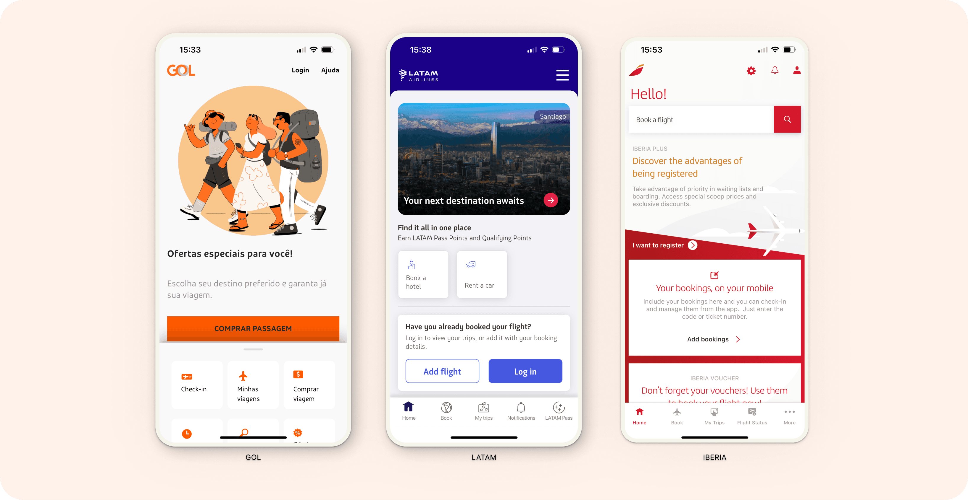
I ran a survey, a heuristic evaluation across 3 airlines and usability tests on 5 competitors' apps to validate some hypotheses. I identified 11 key conversion blockers, cross-validated to guide prioritisation.
Key Findings
1. Price drives the visit, but the experience kills the sale.
The experience itself was the conversion blocker, with a non-intuitive journey that lacked transparency, flexibility, and guidance.
"I'm done with it! I'm not interested in a change for a flight to Barcelona".
Usability Testing Participant
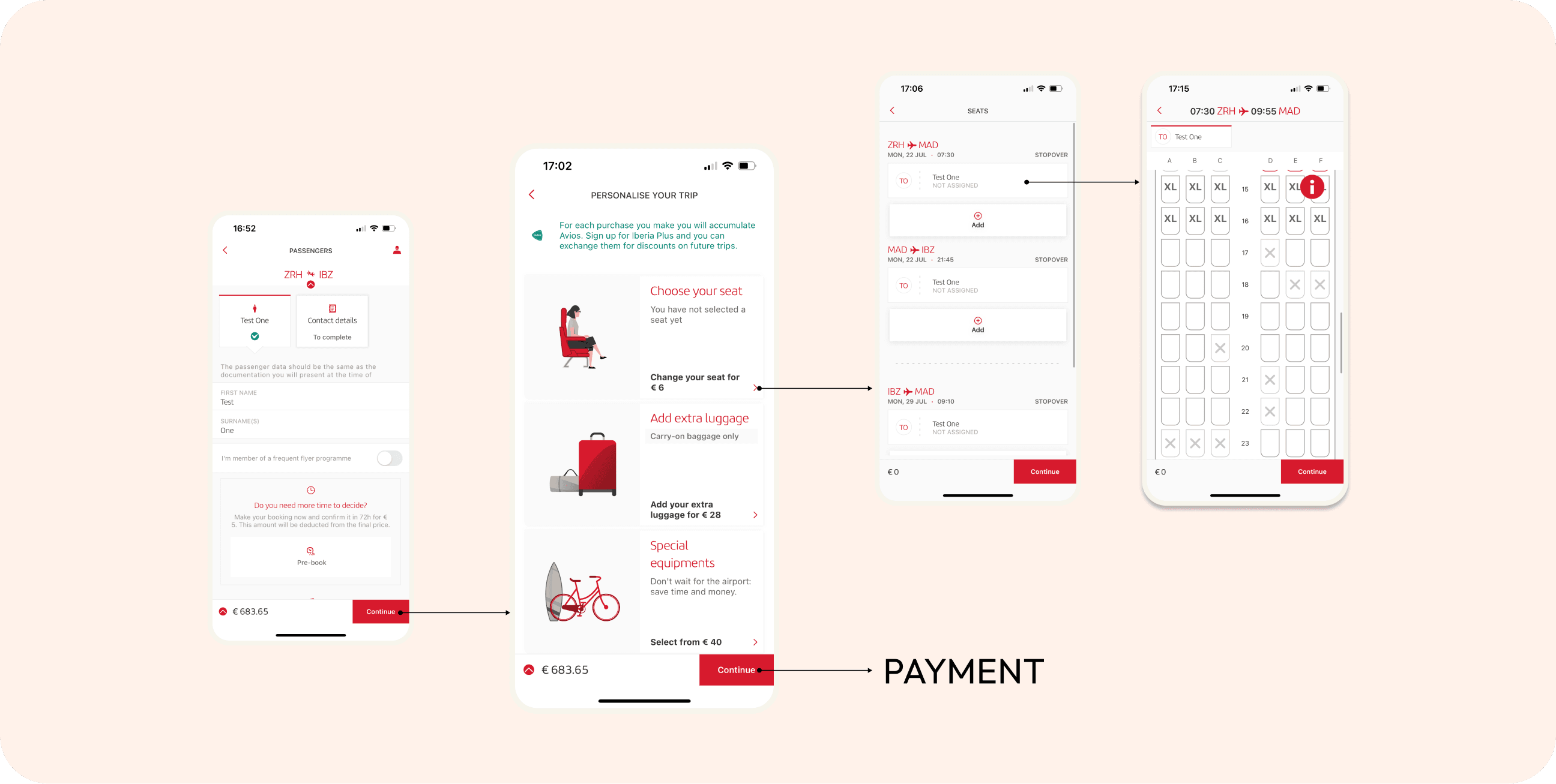
2. Forced data entry, long and mandatory logins with time sensitivity.
Users reported excessive personal data requests and failed logins frustrating and not logical, and redo all the steps due to time sensitivity as deal-breakers.
“That kind of error that you have to come back after so much, really can ruin your experience".
Usability Testing Participant
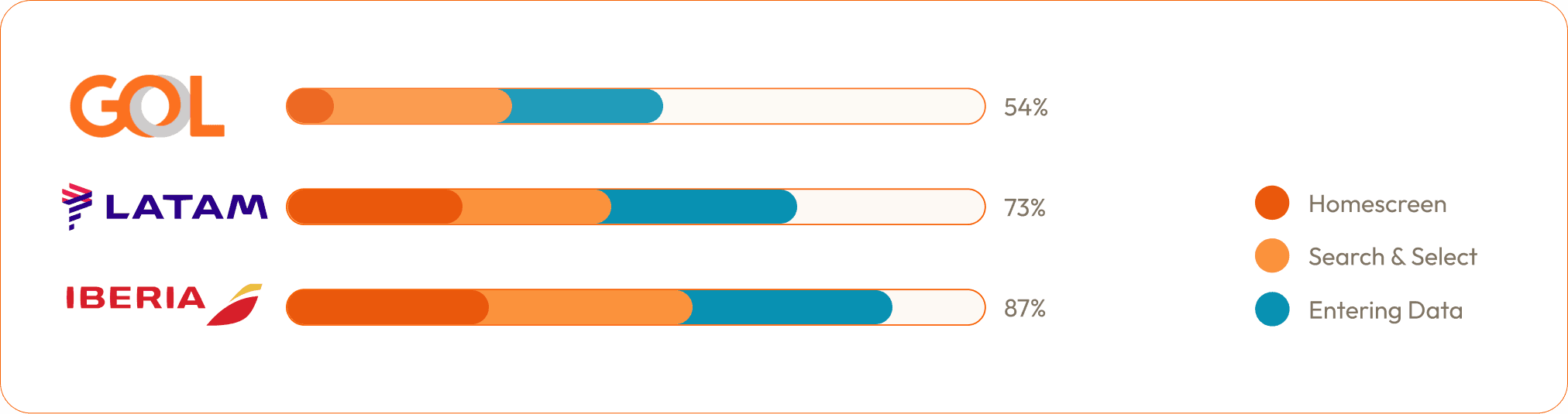
3. Cognitive overload at search results.
Users described it as overwhelming and time-consuming. Iberia, by contrast, broke results into manageable steps with date flexibility and organised in list which users found easy to compare.
"There are several options, but the combinations don't change that much."
Usability Testing Participant
4. Hidden language and currency settings created late-journey frustration.
User abandoned the process, were skeptical about the outcome, felt time-consuming and confusing.
Waste of time in airline offers before payment.
Iberia was the only competitor that let users skip add-ons entirely. Users in testing moved through that section faster and with less frustration.
Design
Shaping the first flight path
I mapped the complete user flow in FigJam based on the data collected and sorted by affinity to create a more intuitive user journey, covering not just the happy path but every variation: guest checkout, currency switching, date changes, add-on skipping, and error recovery. The flow prioritised flexible access and minimal data entry to get users to a booking decision faster.
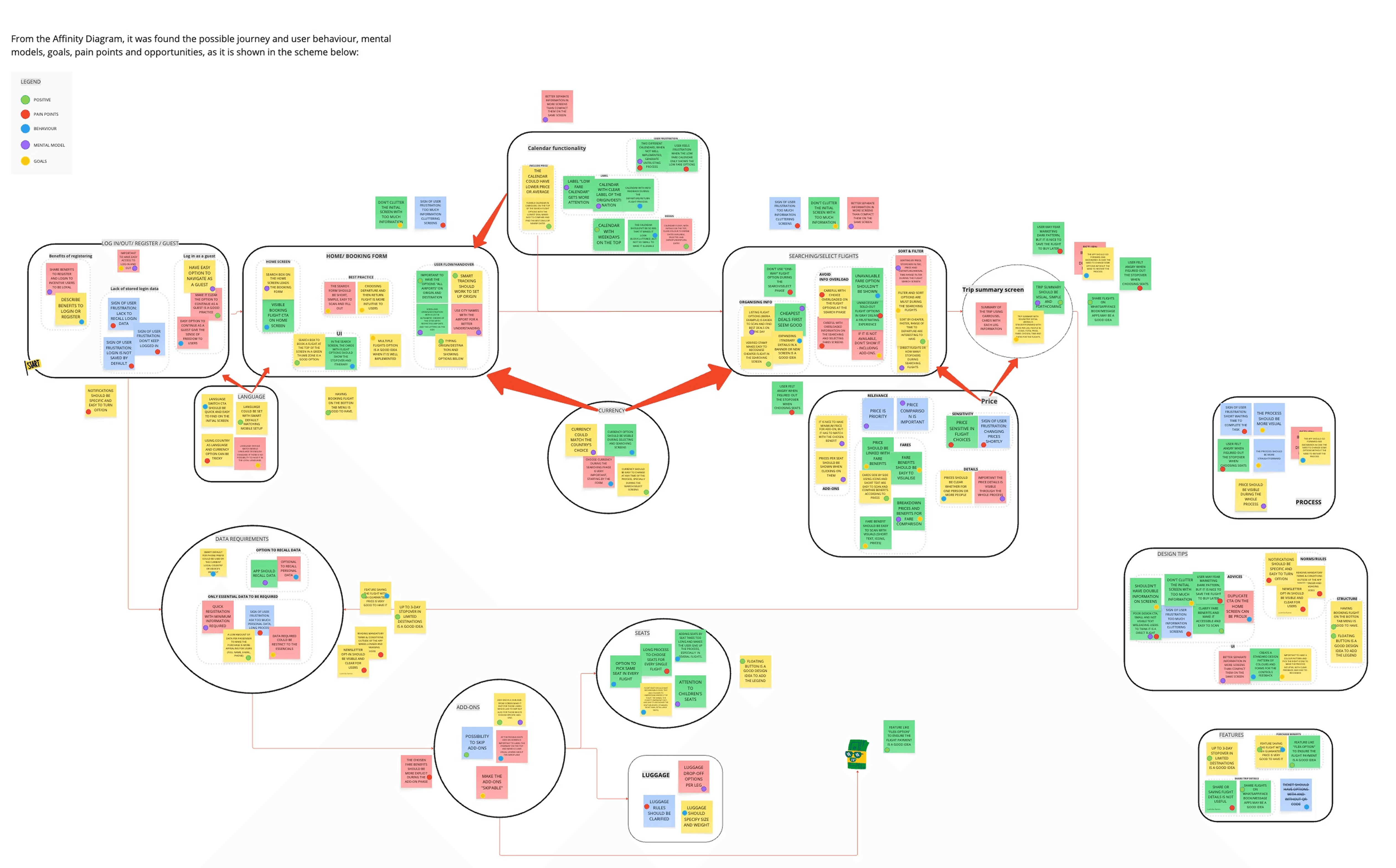
Affinity Map based on Research
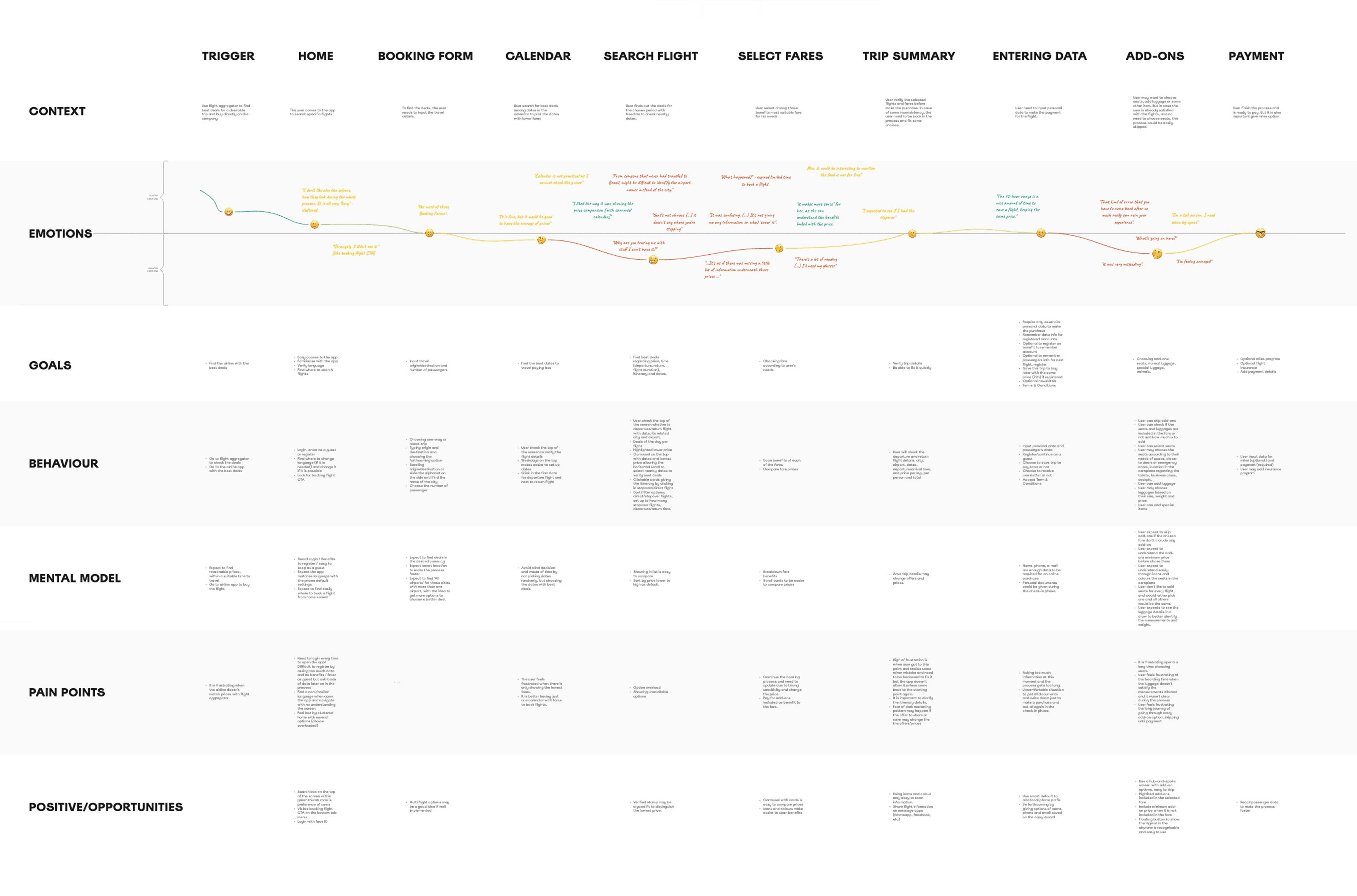
User Journey based on Affinity outcomes and user feedback
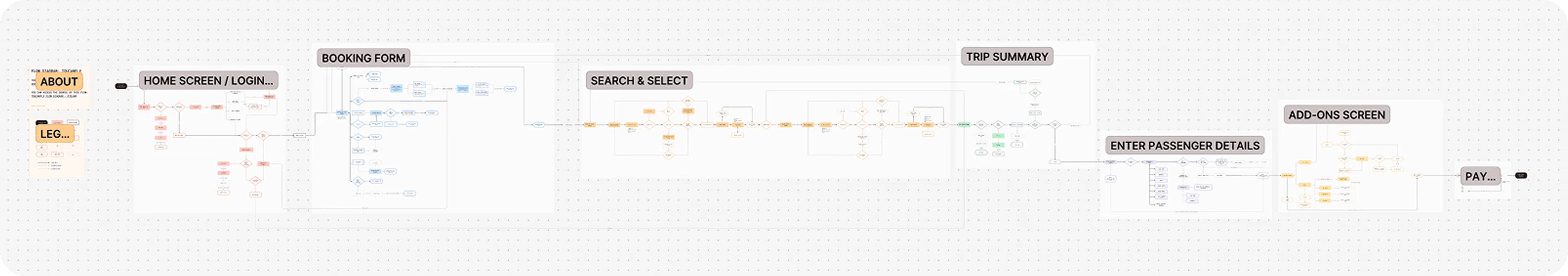
Booking Experience Flow created based on user experience
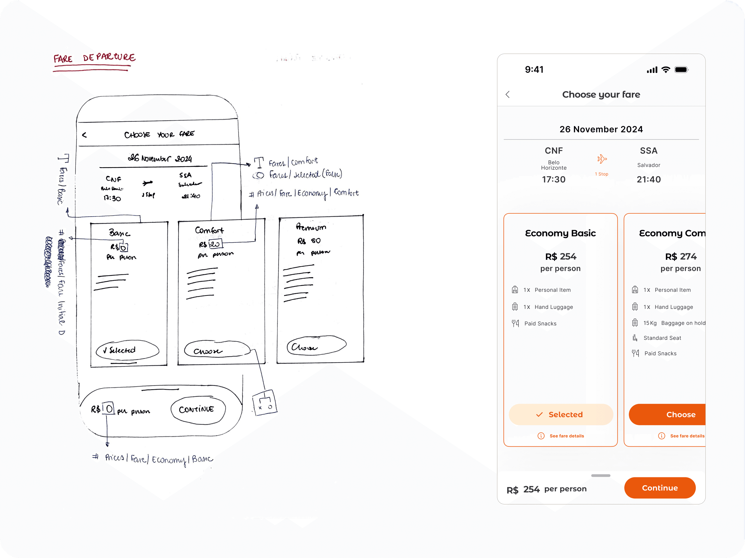
From wireframe to an interface designed to convert
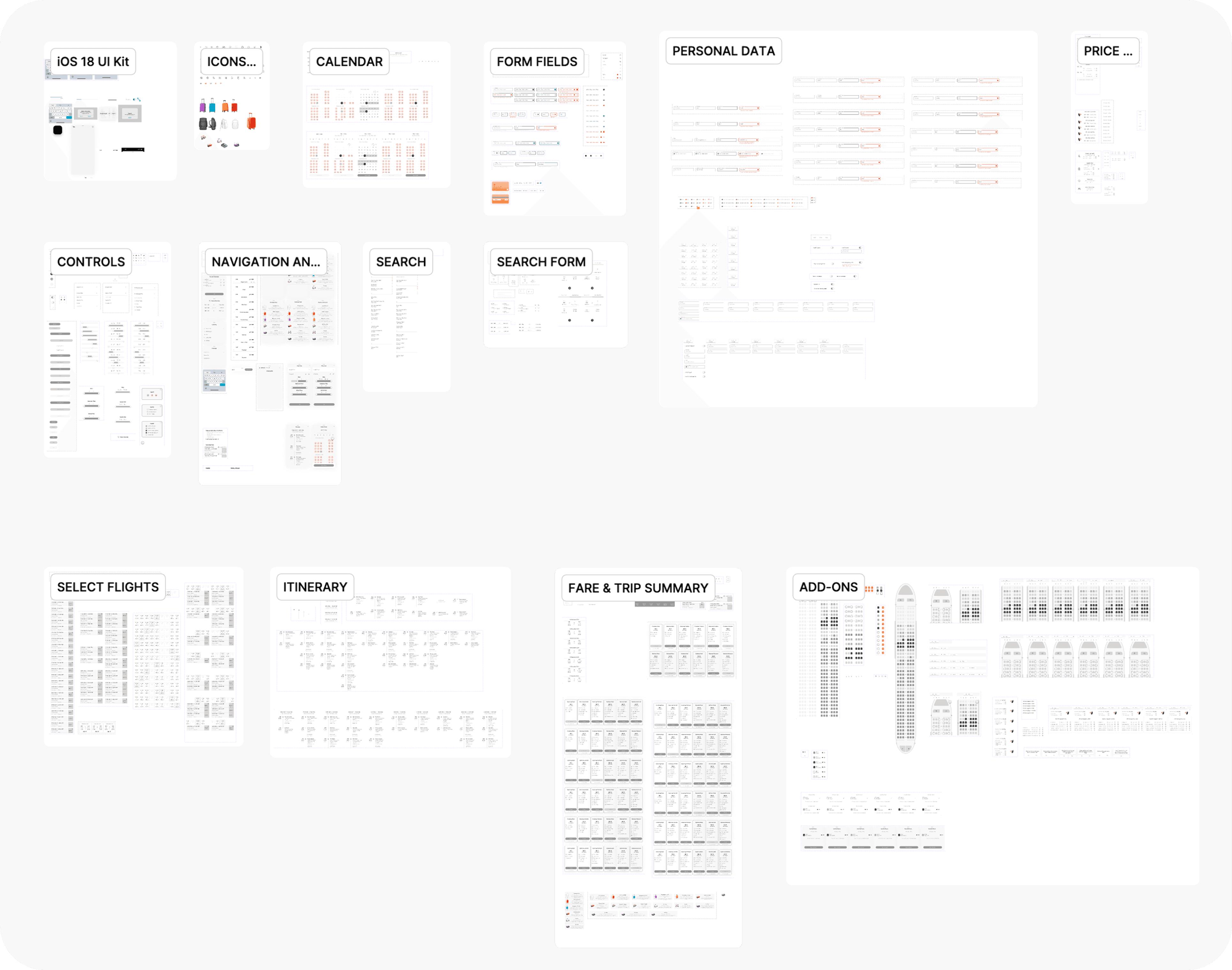
I designed 71 high-fidelity wireframes and crafted 270+ UI components based on iOS, Material Design, and Orbit UI Kits, maintaining the Style Guide I created for the “brand-less” product. Every component was either heavily adapted or created from scratch in Figma to fit the product’s vision.
Design Priorities:
Product-led home screen: 43.8% dedicated to booking through three entry points (Search Bar, Best Deals Carousel, Menu), creating multiple pathways to purchase.
Conversion drivers embedded in the flow: loyalty sign-ups, transparent pricing, upsell moments, and flexible guest access — all without disrupting the booking rhythm.
Accessibility for a global audience: intuitive language and currency switching using universal icons and references, visible from the start.
System thinking: consistent, scalable asset library organised with variables, styles, and atomic design principles.
Prototyping to prove the concept
I used variables, variants, and conditional logic in Figma to create a realistic prototype that covered the complete booking journey. This level of fidelity was intentional: it makes usability testing more accurate, helps win stakeholder buy-in, and gives developers a head start on understanding interactions.
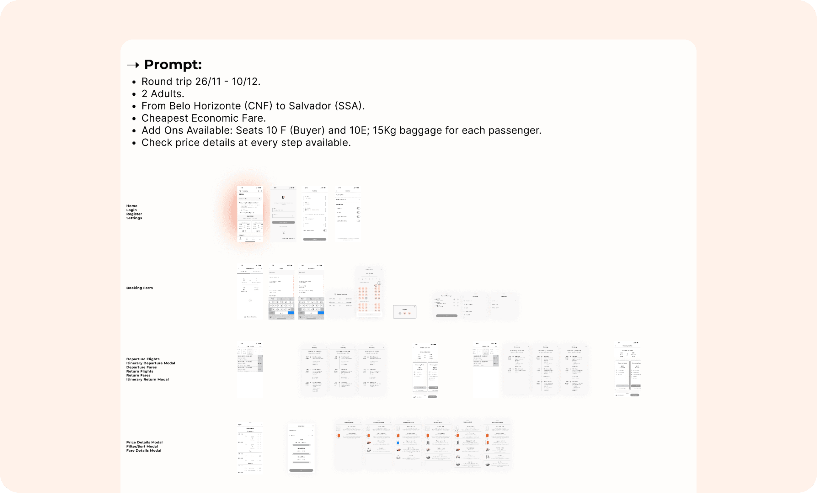
Try the Prototype in Figma.
Annotated handover for development
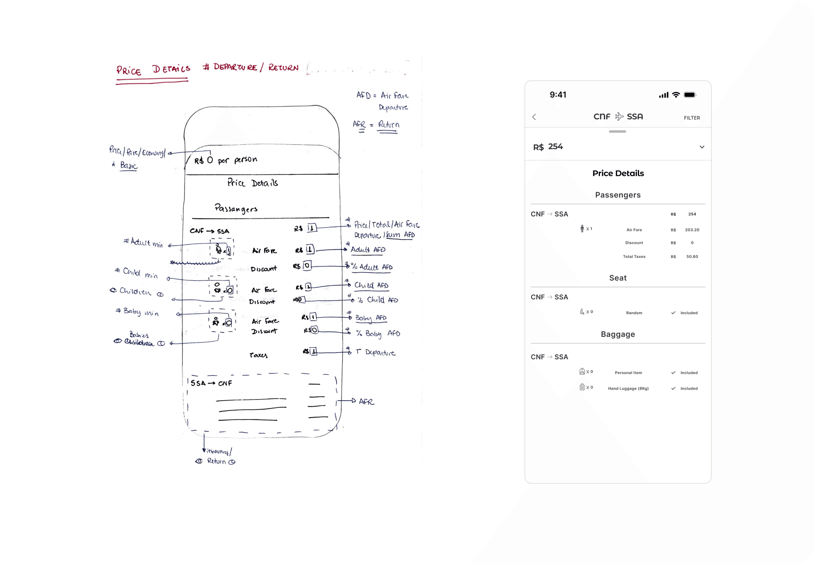
Every wireframe was documented in an extensive annotation handover: hierarchy concepts, layout structures, copy, interaction rules, conditionals, and the reasoning behind each decision.
Solution
Optimised home screen for conversion
Problem addressed: Cluttered screens with poor hierarchy.
4× faster potential to activation than Gol, which leaves 52% of its home screen empty and ToucanFly leverages 43.8% to three booking entry points: Search Bar (9.1%), Best Deals Carousel (33%), and Menu Option (1.5%).
Delivering value to users with the Best Deals Carousel, increases potential engagement to activation.
Streamlined an efficient booking flow
Problem addressed: Fragmented booking journeys.
Up to 40x faster than LATAM with the Best Deals Carousel feature. Cuts up to 60% of the booking process by eliminating the searching phase.
Reducing churn with the Smart Calendar with colour-coded pricing adds transparency and predictability.
Reducing friction and possibilities of churn with flexible Search Bar Calendar that allow users to change dates without restarting the full journey, optimised Data Entry requirements facilitating login registry in the middle of the journey, and Skippable add-ons that shorten time-to-purchase.
International-friendly experience
Problem addressed: Limited transparency and accessibility.
Language and currency switching visible from the first screen using universal icons — no hidden settings.
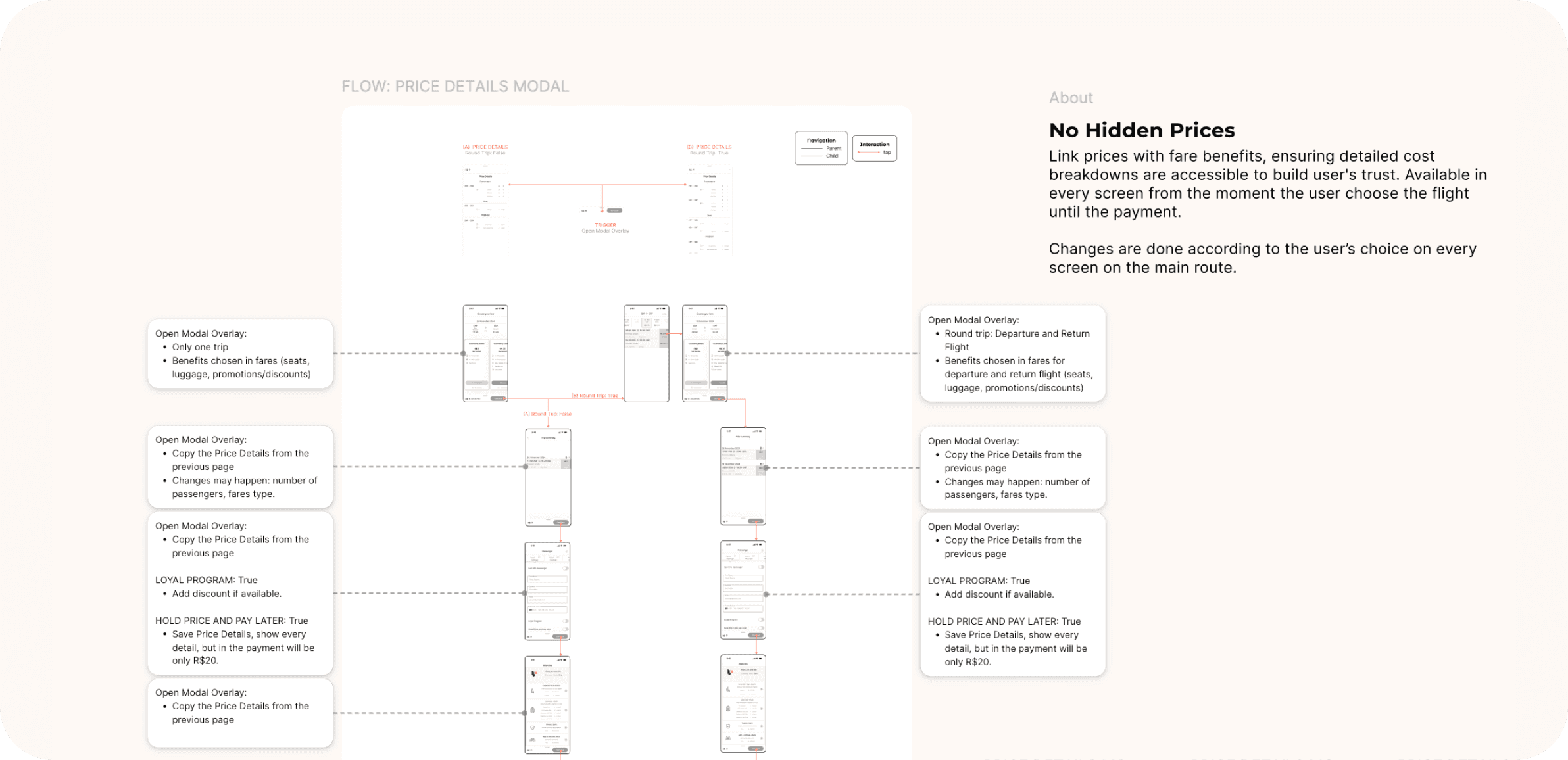
Transparent fare breakdowns linked to benefit explanations reduce late-journey drop-offs caused by unexpected fees
Final Takeaway
What I learned from going end-to-end
Research-driven UI decisions driving business outcome.
Making a triangulation between competitive analysis with heuristics evaluation and survey enabled to identify UI patterns that drive action, design strategies to improve usability by removing friction and prevent errors. Every component and flow choice traced back to a research finding, oriented by product strategy.
Product-led thinking shaped the entire architecture.
Prioritising booking actions on the home screen, embedding conversion drivers and improve usability in the flow, considering designing multiple pathways — considering also the unhappy path — to decrease time-on-task for a faster purchase created measurable advantages over competitors.
My recommendations
Improve accuracy with better research: Larger research sample would strengthen the data.
15 survey respondents and 4 usability tests gave clear directional insights, but a production project would need a broader sample to validate at scale.
Accessible-first colour system: Colour accessibility was intentionally deferred.
Current wireframes has colours for a better visual presentation, but I worked in grayscale to prioritise UX and interaction design. A production version would require full colour-contrast testing and WCAG compliance.
AI- Assisted Prototyping — Vibe Coding: High-fidelity prototyping is powerful but costly.
The variable-based Figma prototype proved the concept convincingly, but in a team setting, this level of fidelity is a trade-off against speed. Cross-functional collaboration and tools like Figma Make could achieve similar results faster.
Testing Sprint: First iteration would bring full picture on real performance and improvements.
This project was part of the UXDI Professional Diploma in UX Design. Hypothetical product, real data, evaluated by senior product designers, but no possibility to testing in real world.