Discovery & Ideation
Diagnosing what the data was hiding
Design was indeed part of the issue — missing navigation and footer, poor accessibility, inconsistent elements increasing cognitive load, clunky hierarchy, and spammy visual patterns.
I cross-analysed the analytics with heatmaps, scroll data, and session recordings (Google Analytics and Microsoft Clarity) to map user behaviour, audit core issues, and prioritise next steps.
Key Findings
Wrong target audience.
The majority of visitors were 18–24 year olds, while the target clients were business owners aged 35–45. Those most interested in the website were likely students or people aspiring to become paid traffic managers.
Trust deficit and misplaced information.
A ~5% bounce rate and 82-second average sessions looked healthy, especially with 30% of users reaching the footer. Session recordings told a different story: the 13% return rate was inflated by external link redirect loops, and users likely hadn’t found the information they needed.
Checking the competition
I analysed competitors on search engine results pages (SERPs) for common queries, evaluating their online positioning, rich results, website and social media presence. The goal: assess their services and value propositions to create a competitive positioning strategy.
Key Findings
A clear value proposition wins in a crowded market.
In a Red Ocean — a highly competitive, settled market — the better-performing agencies relied on brand positioning with a clear competitive advantage and, generally, stronger user experience on the website.
Branding patterns bring familiarity to the field.
From organic results, those with better rankings used creative brand naming (41%) or marketing-related naming (33%), with predominantly blue logos. Agencies using personal naming and non-standard brand colours were poorly ranked and relied on paid traffic.
Rich results favour localisation and content.
Local business setup on Google and generating valuable content on Instagram, LinkedIn, and YouTube increased competitiveness in organic search.
Badges and certifications increase authority.
Several websites included Google Partner Ads badges or official certifications to demonstrate service quality, generating credibility in the field.
From users to customers
We needed to deeply understand the users and ideal customers to design a website that would truly perform. Sânzio didn’t want to risk losing clients by creating a survey, nor commit potential ones with interviews. The strategy: work with AI-assisted research now, iterate later with real data.
Proto-personas: I created profiles based on current clients, ideal clients, and prospects who might be interested.
Empathy Map: generated all crucial information to surface expectations, needs and pain points.
Value Proposition Canvas: After a deep understanding of the business and set the services, match the value of the services with each persona, solving needs and ease pain-points.
Customer Journey: Enabling touchpoints checks to improve experience, add conversion drivers, and facilitate onboarding.
Understanding the business vision
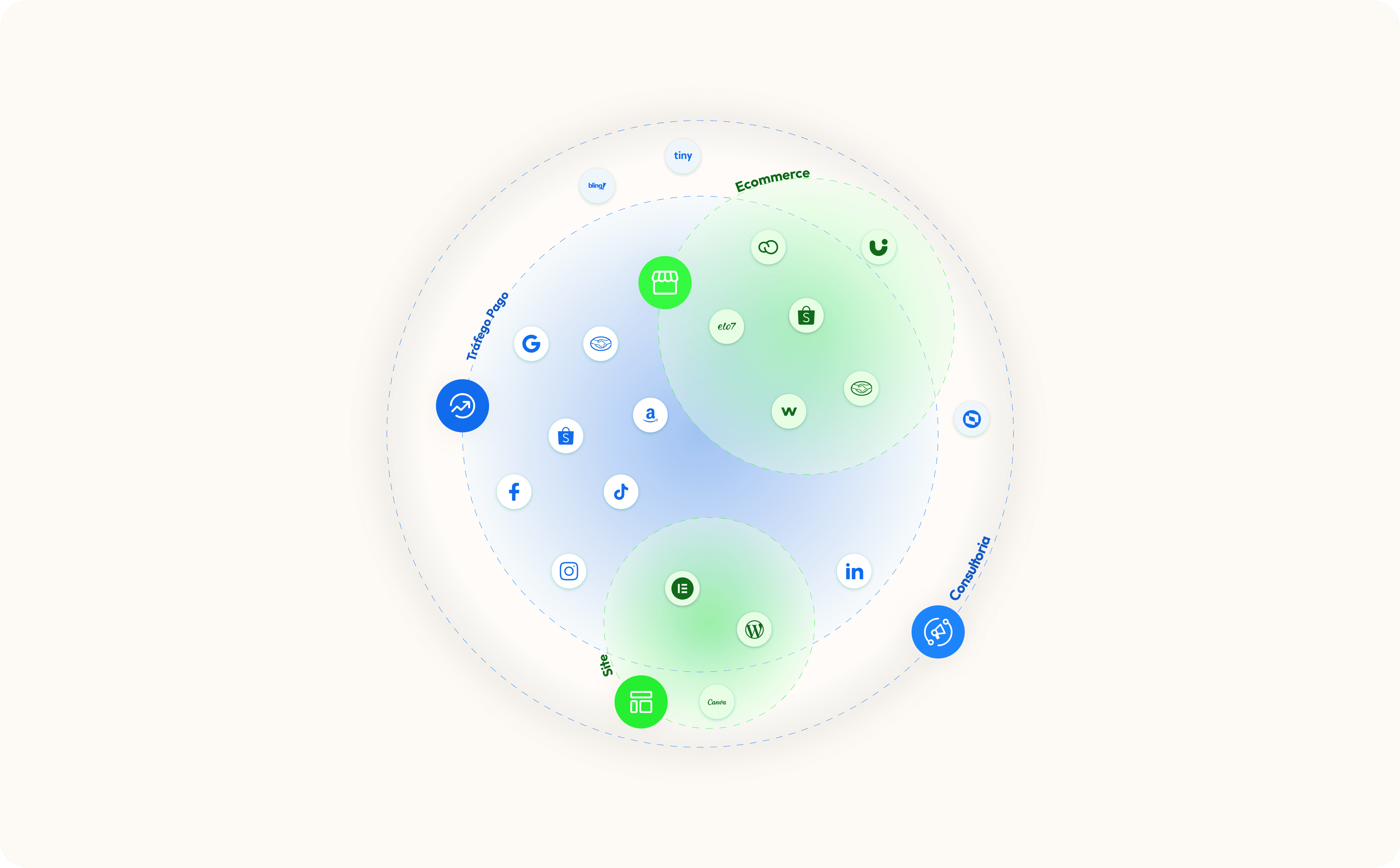
First, I needed to understand the business itself — what the agency was offering and the best strategy to make it clear for users while improving the pricing approach. I restructured the offer into 3 categories: Paid Traffic Management, Professional Website Creation, and Marketing Consulting.
With the services defined and previous data mapped, I analysed opportunities, threats, strengths, and weaknesses.
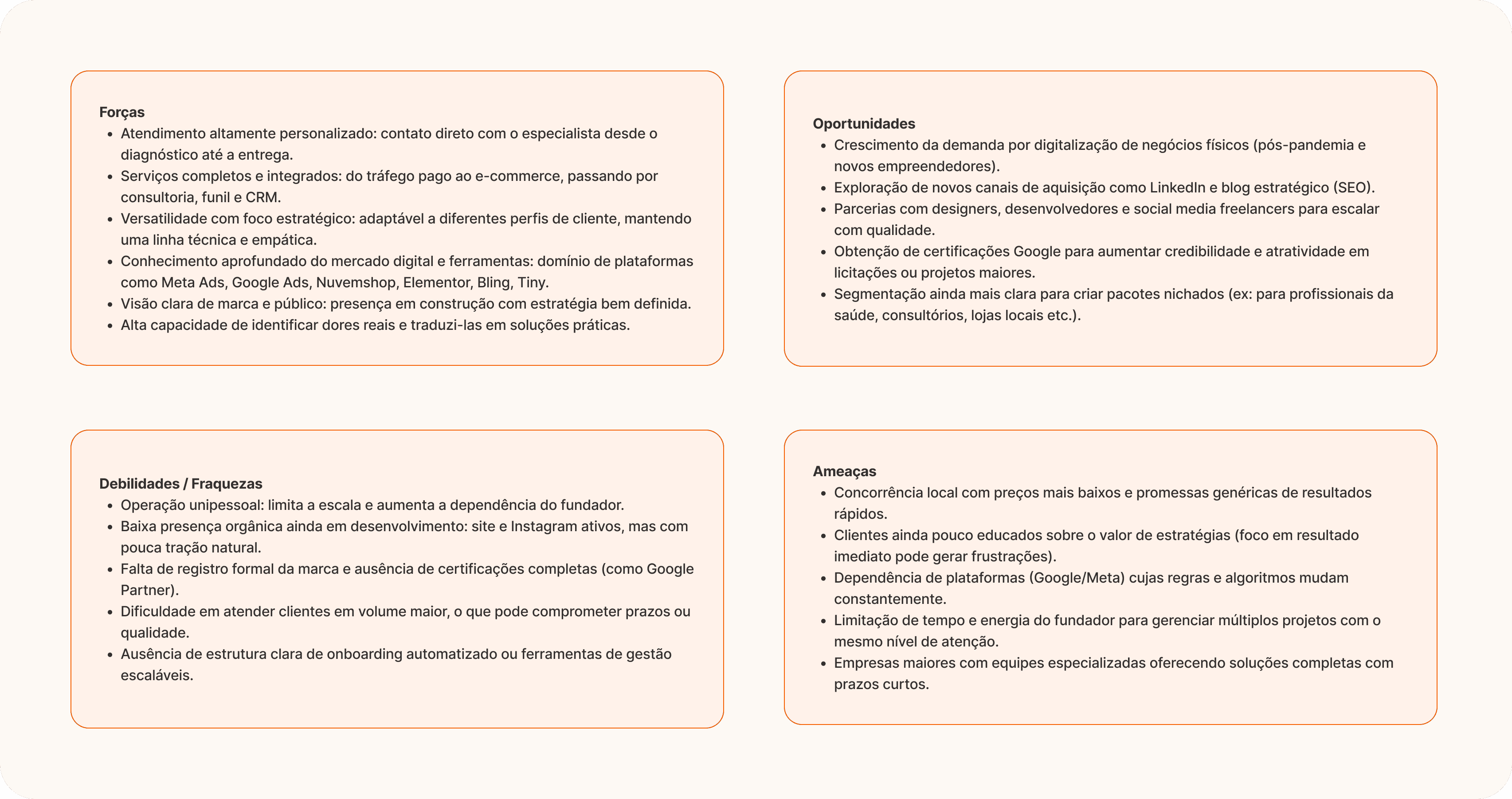
This made it possible to map user needs and pain points against the value each service could provide, creating the Value Proposition Canvas, and to make the Business context clear with the Business Model Canvas.

Design
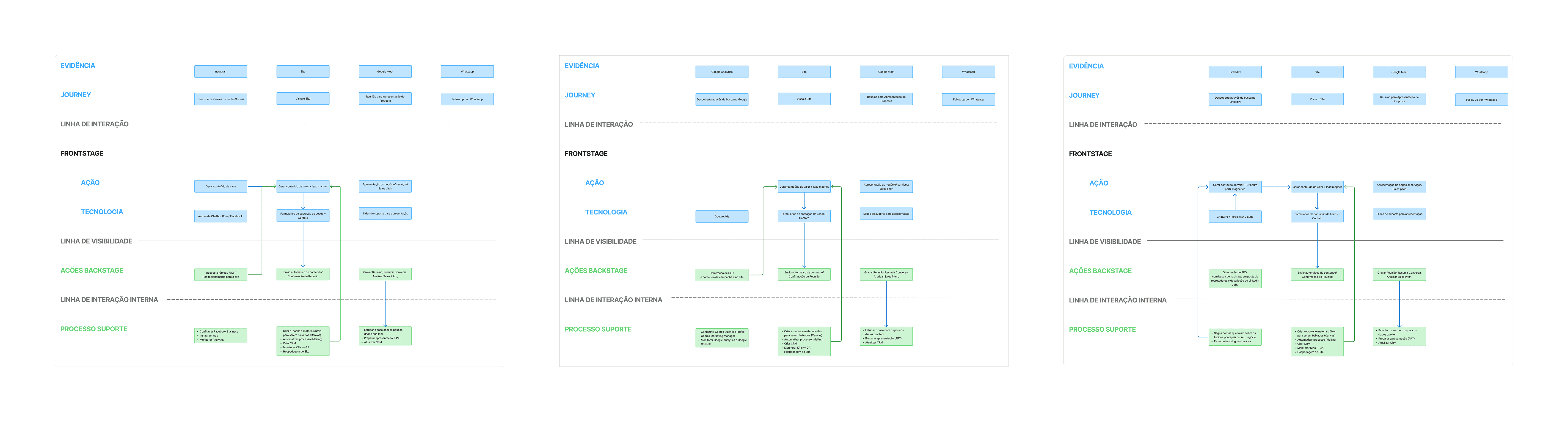
Improving clarity with the service experience
I needed a clear process to communicate outcomes to users and design an intuitive architecture that accounts for the relationship between the website and other channels. I created a service blueprint for each persona to map how each service presents its value across the full experience.
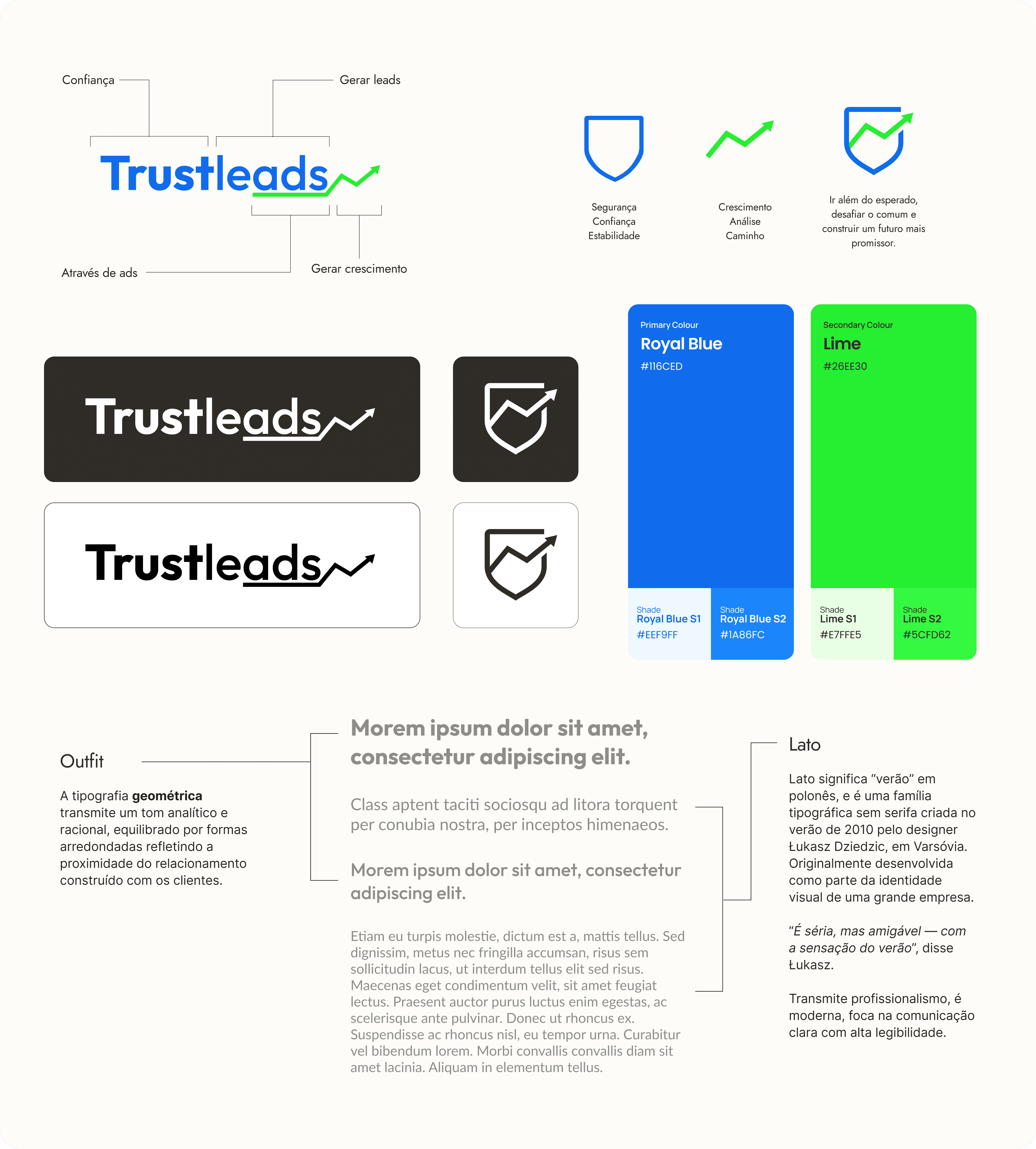
Brand positioning
Sânzio opted for a full revamp with a new name and domain to better represent his business and vision. The goal was to position him among the top-performing brands in organic search.
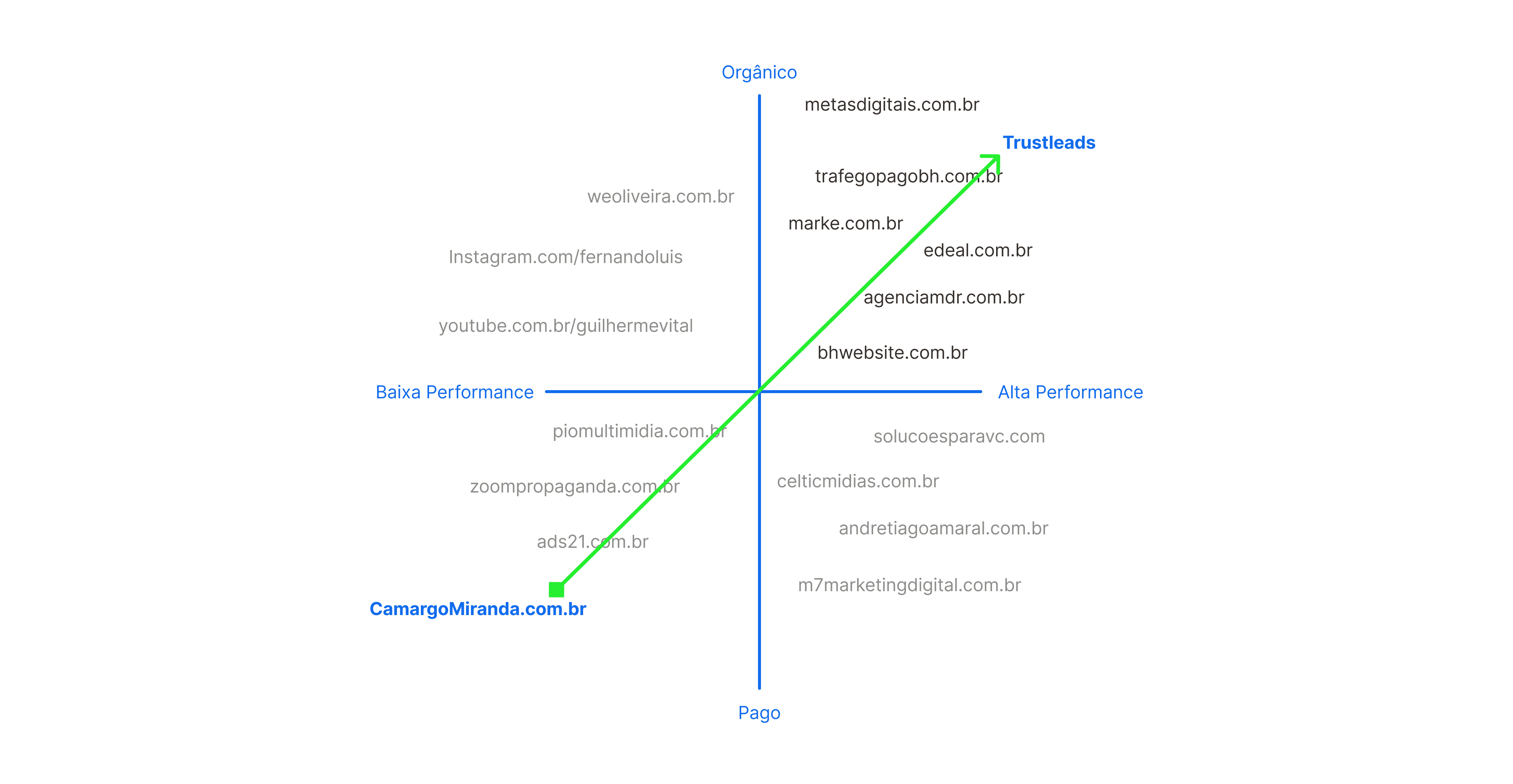
The strategy: create a brand that generates familiarity — slightly blending with competitors but differentiating through user experience, website performance, owner reputation, and content strategy.
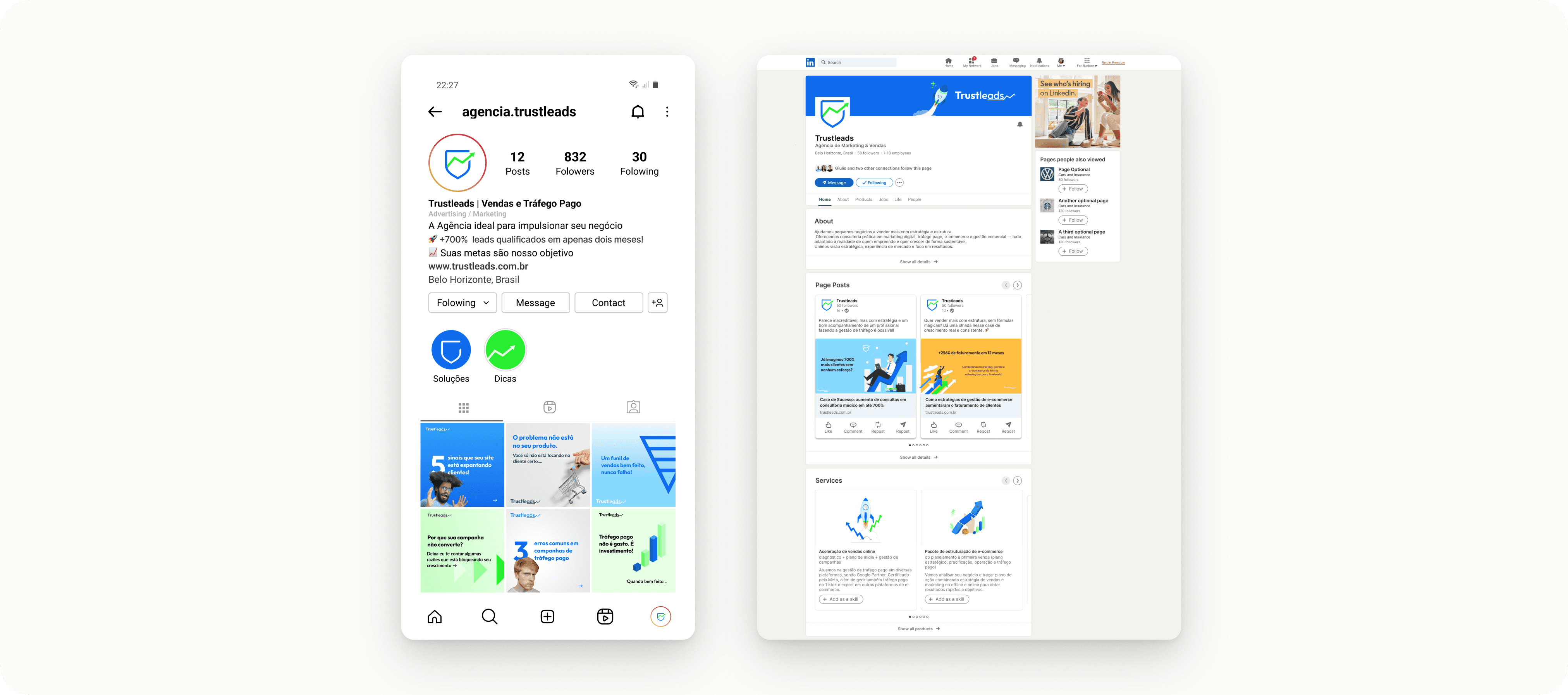
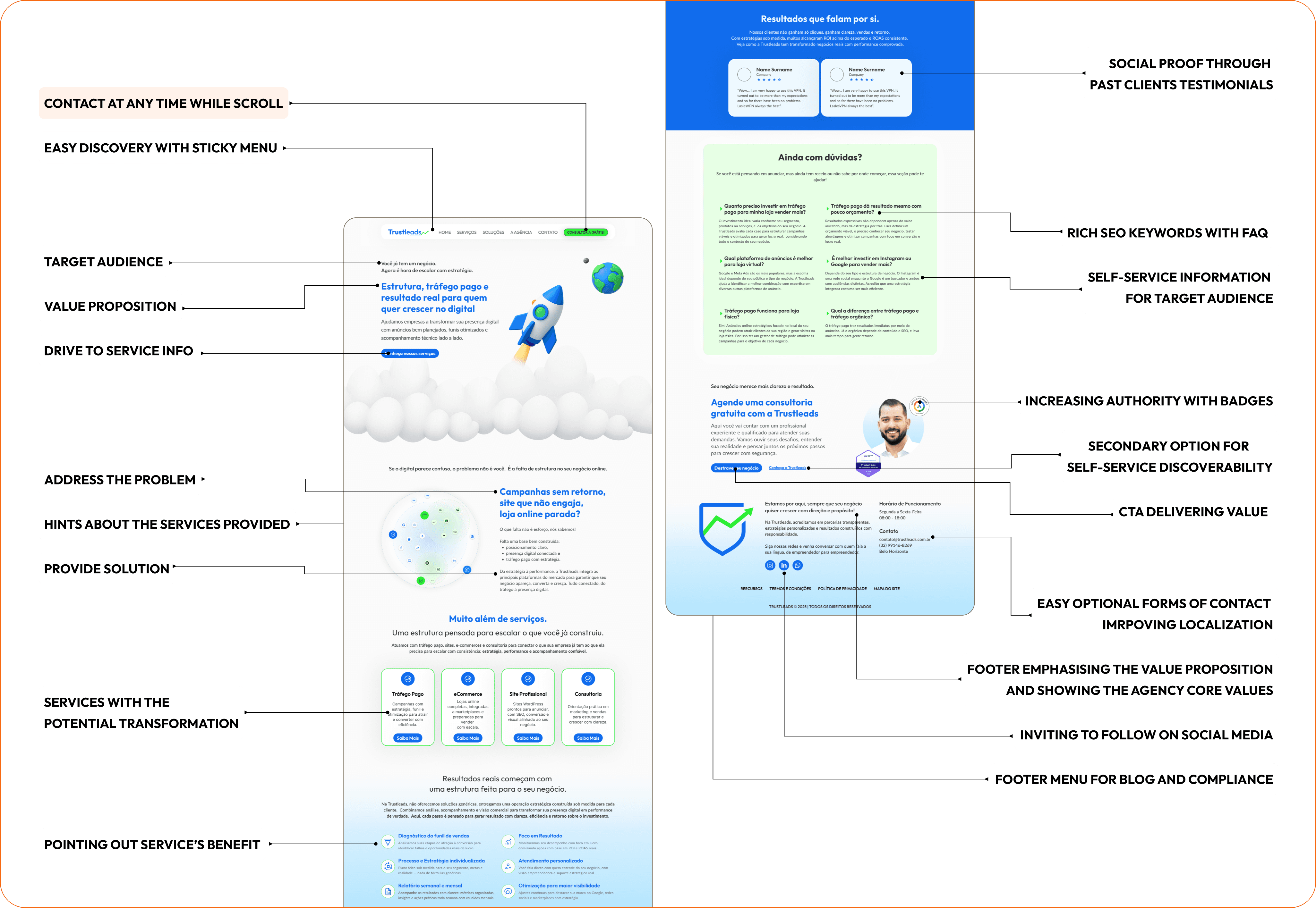
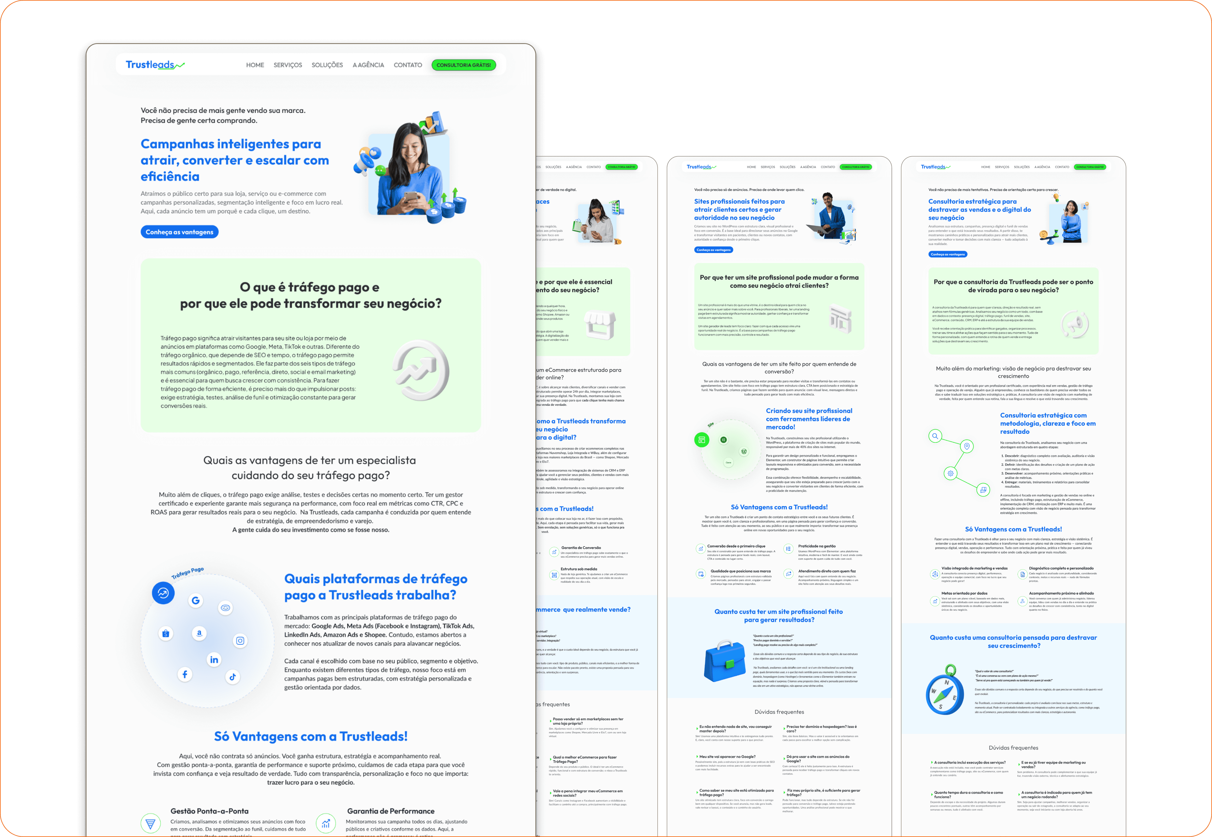
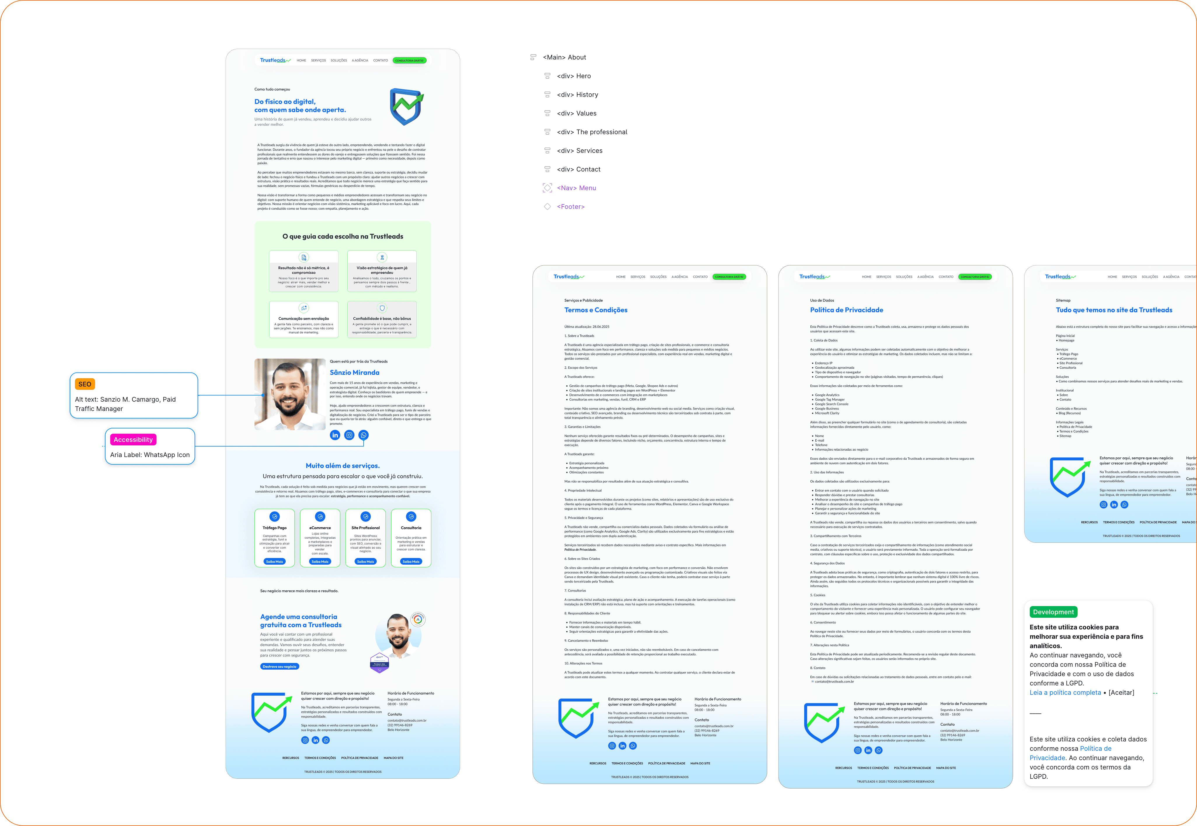
Growth-driven and self-service website
I created a 15-page site map structured around self-service discovery: prospects find answers through content before needing to contact, reducing unqualified calls and increasing conversion potential.
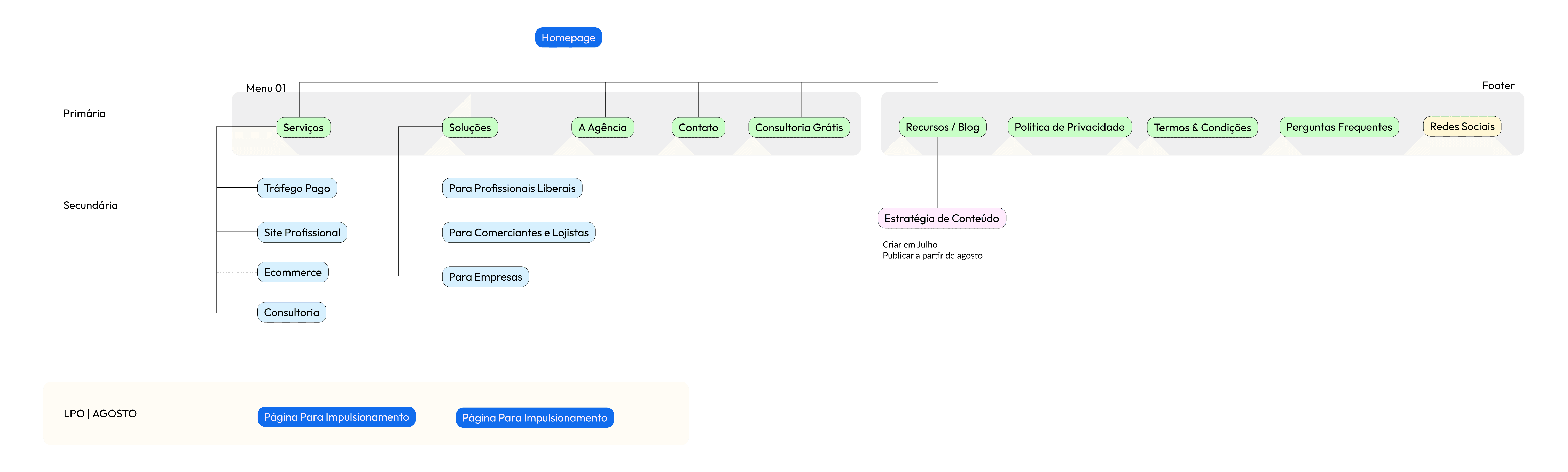
I mapped content based on the customer journey to position the right message at each stage, aligned with keywords to drive the core action (booking a free consultation) while increasing relevance for search engines.
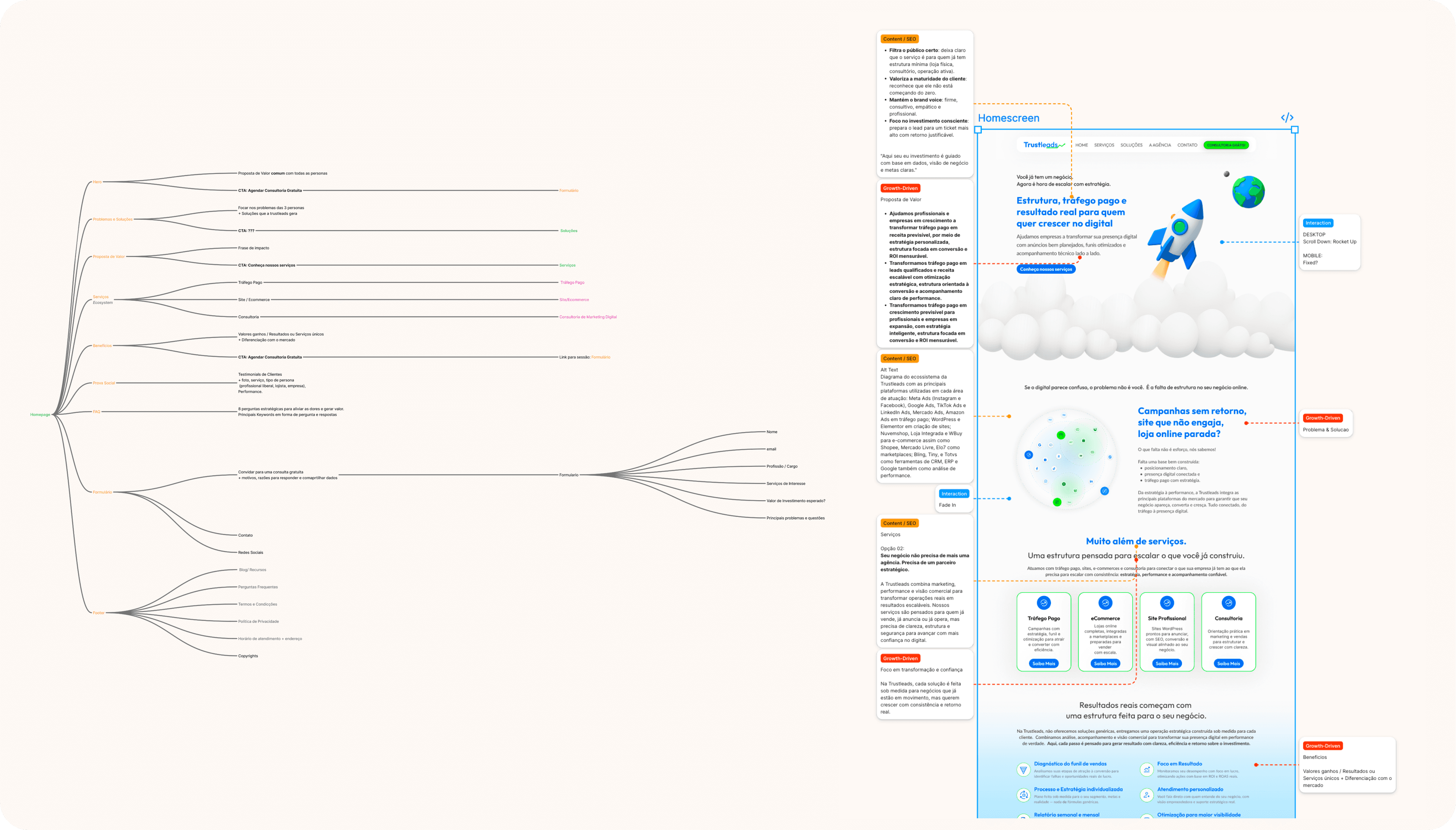
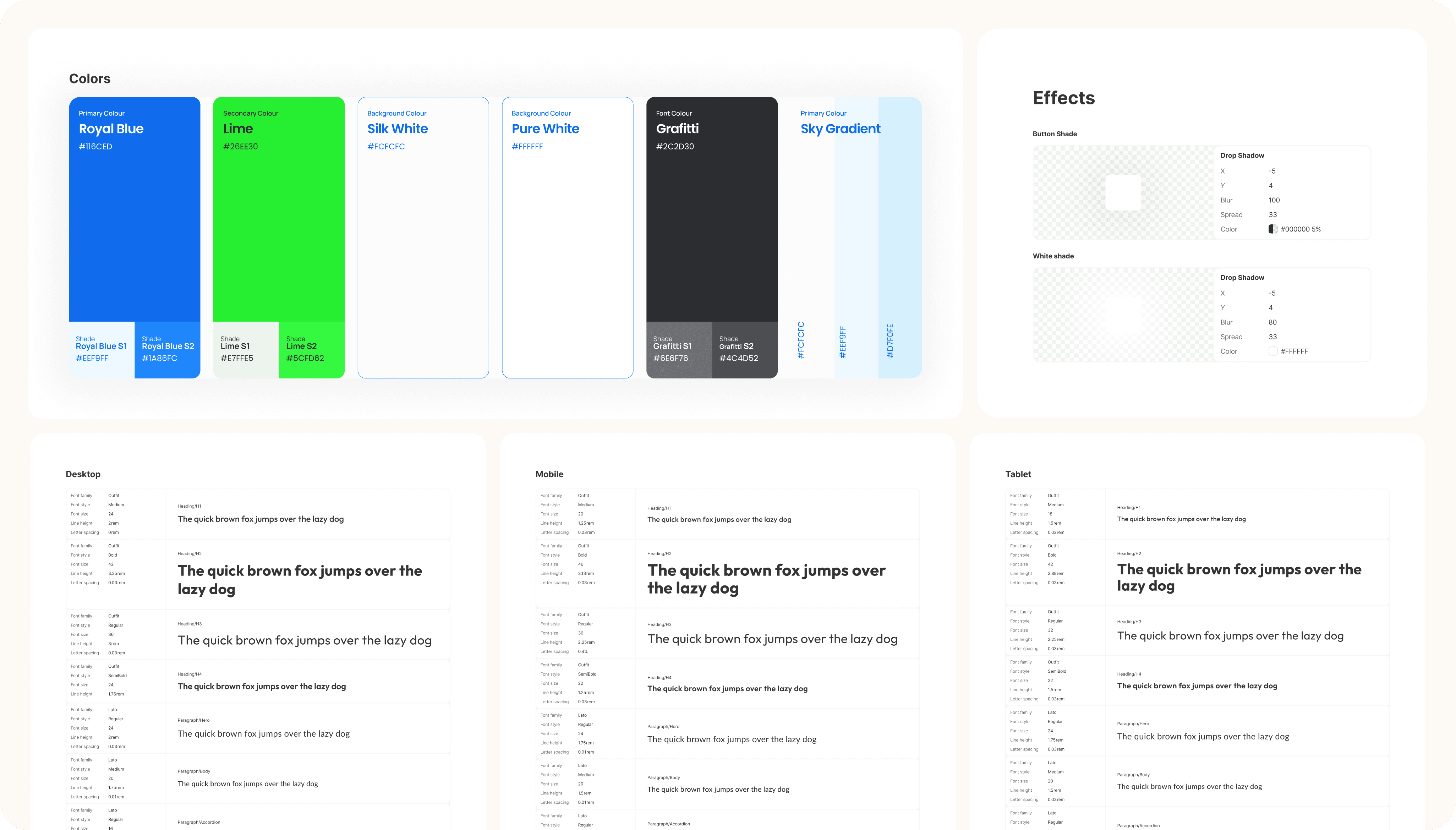
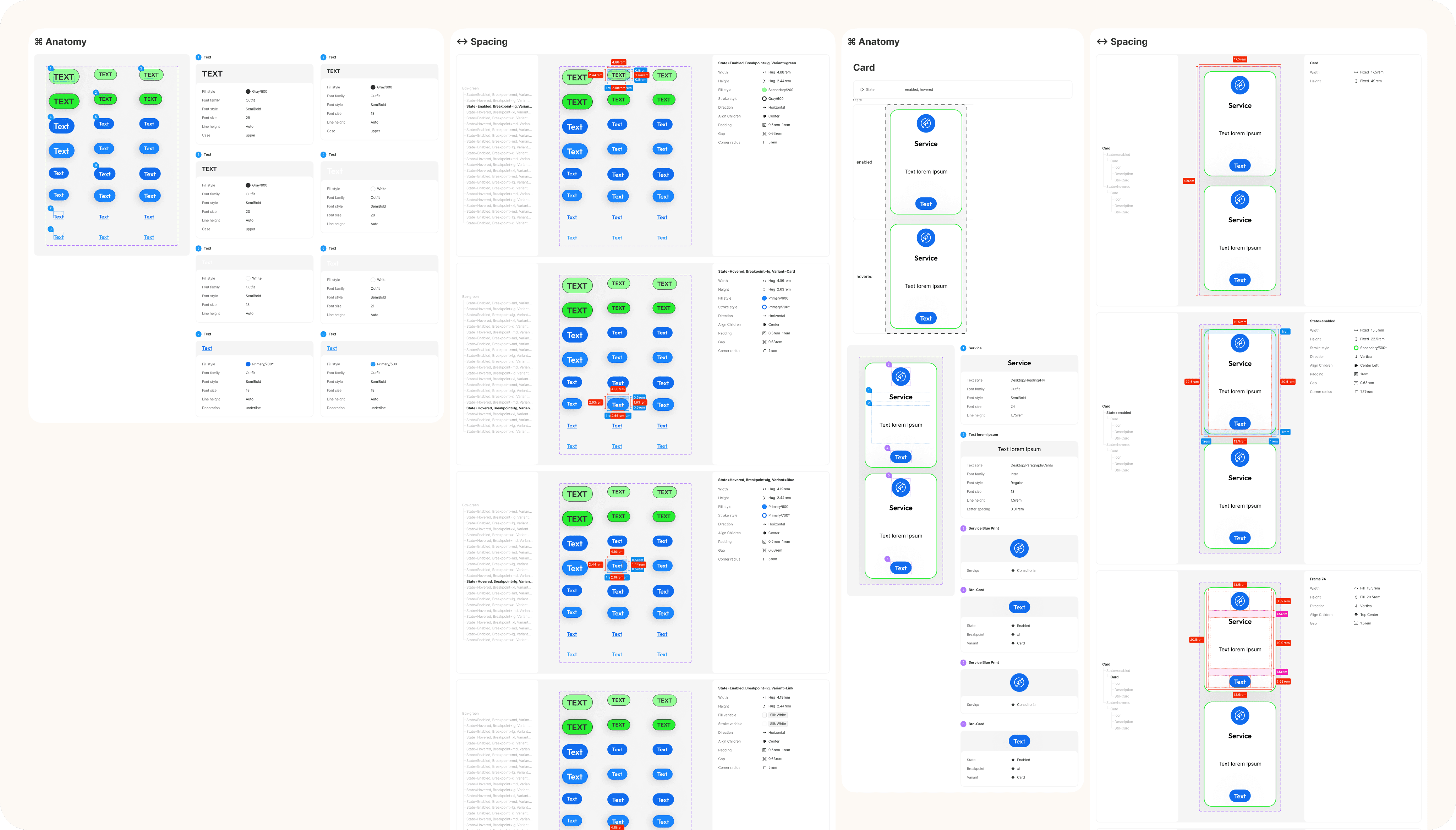
I designed wireframes for 10 responsive pages with embedded conversion drivers — social proof, clear value propositions, and strategic CTAs — alongside a style guide for WordPress/Elementor implementation. The remaining pages would follow after iteration and content readiness.
Solution
From scattered agency to focused growth engine
Every solution targeted the same goal: increasing the LTV: CAC ratio by improving the quality of leads, website performance, and brand trust. The website became self-service, with enough information for prospects to evaluate fit before contacting. Transparent pricing, structured services, and an intuitive architecture guide users toward the primary action — booking a free consultation.
1. Make the website the first sales touchpoint
Optimising the website for the target audience means prospects perceive value faster.
Growth-driven copy backed by the customer journey, connecting through identification, addressing their needs, with a potential of at least 15% decrease in TTV.
When they reach out for a free consultation, users are aware of the core offer, which doubles potential for conversion and therefore reduces CAC by at least 60%.
2. Generate value through structured services
Clear service descriptions and productised packages enable users to evaluate and decide independently, reducing support by 95% and improving lead quality.
Improved architecture for discoverability, demonstrated benefits, pricing range idea and trust signals throughout, generate a clear offer of his services, impossible to refuse, but generating trust by transparency, beating the competition, with potential of a 25% increase in LTV.
3. A website ready to thrive
WCAG-compliant accessibility, ARIA labels, indexed sitemap, keyword-rich content, and optimised images make the website performant for both users and search engines — increasing organic competitiveness.
All delivered in Figma, with details for implementation on WordPress/Elementor to reach <90% website performance.
Final Takeaway
What this project taught me
End-to-end thinking and a systemic product approach.
The website was part of a larger system, the process revealed where the business needed to focus effort for better outcomes.
Balancing conversion drivers with usability.
Marketing websites often prioritise bots over humans. Designing for users first creates a natural path to serve both conversion and usability.
Communicating difficult realities to the client.
Showing a client that their assumptions don’t match the data is challenging. I adopted multiple frameworks to present failures and solutions with clarity.
My personal Recommendations
Ship faster, learn quicker, iterate.
The scope expanded beyond what the client expected. Clearer boundaries upfront and shorter sprints to validate readiness at each phase would have been more valuable.
When research access is scarce, try AI-assisted methods.
The client couldn’t provide user access, common in early iterations. Tools like Attention Insight (AI-based heatmaps) can provide directional hints until real data becomes available.
User research for next iterations is non-negotiable.
There is no need for a complex set of research, it could be done in faster sprints crossing data through surveys, usability testing and interviews, and mapping clients' feedback.
Final Note: The design was handed over but not shipped. The client paused implementation to pursue an offline strategy. The process itself gave him more awareness about his business and new directions for it.