Discovery & Ideation
Optimising the experience for many cultures
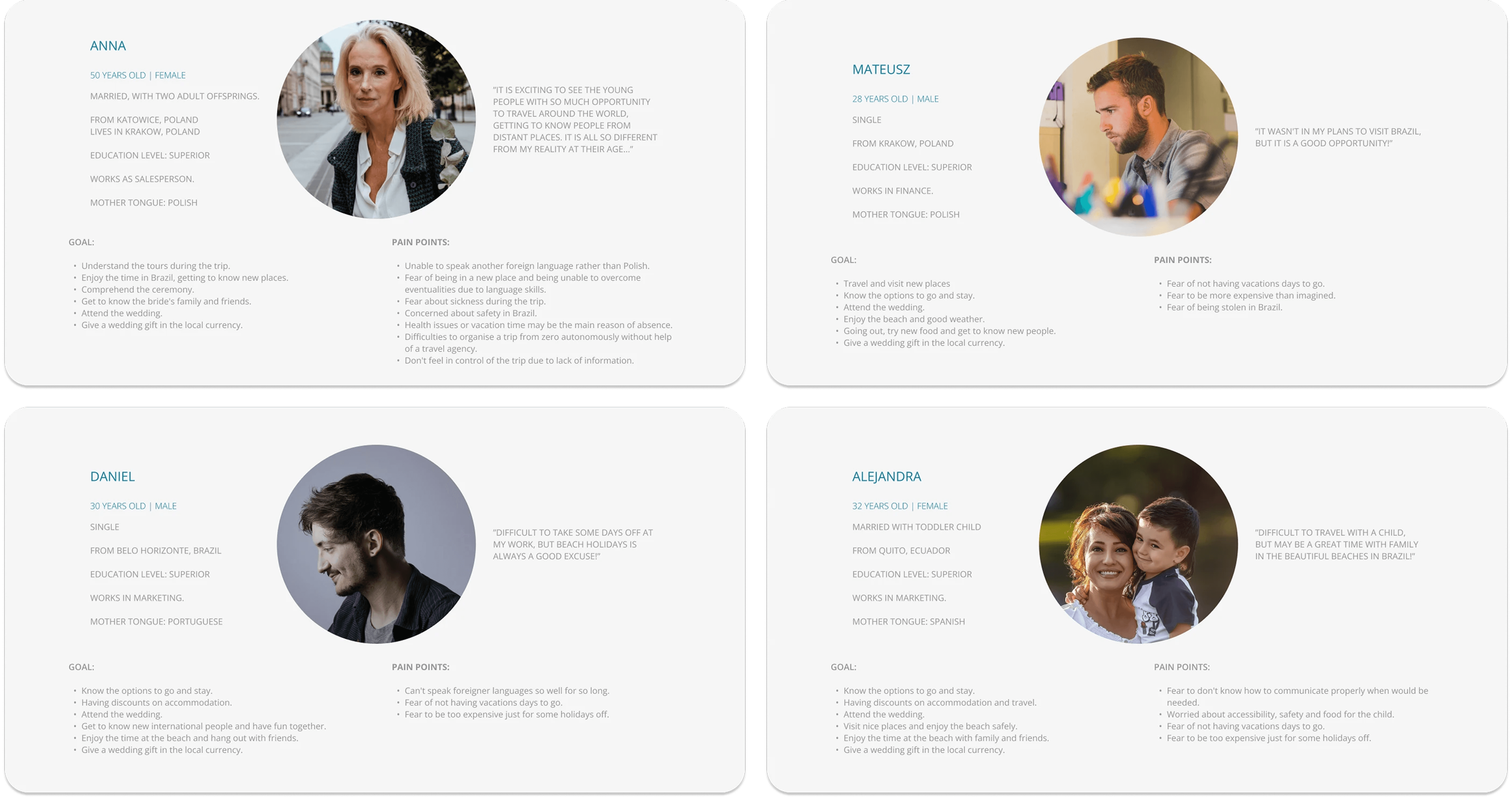
I combined informal guest research with secondary research on digital adoption, cultural communication habits, and gift-giving norms across markets, focusing on the two major cultures — Brazilian and Polish, then created personas and mapped the end-to-end guest journey.
Key findings
Digital adoption splits sharply by culture. Brazilian guests were comfortable with online RSVPs and digital event hubs. Polish guests were not — Poland’s digital adoption scores are among the lowest in Europe, meaning the interface had to be simpler and more guided for that audience.
Communication channels diverged by market. Brazilians rely on WhatsApp and Instagram; Polish guests favour Facebook Messenger. The website link and RSVP follow-ups had to reach guests where they already were.
Automatic translation was not an option. Each translation had to feel native, which meant manual work across all four languages.
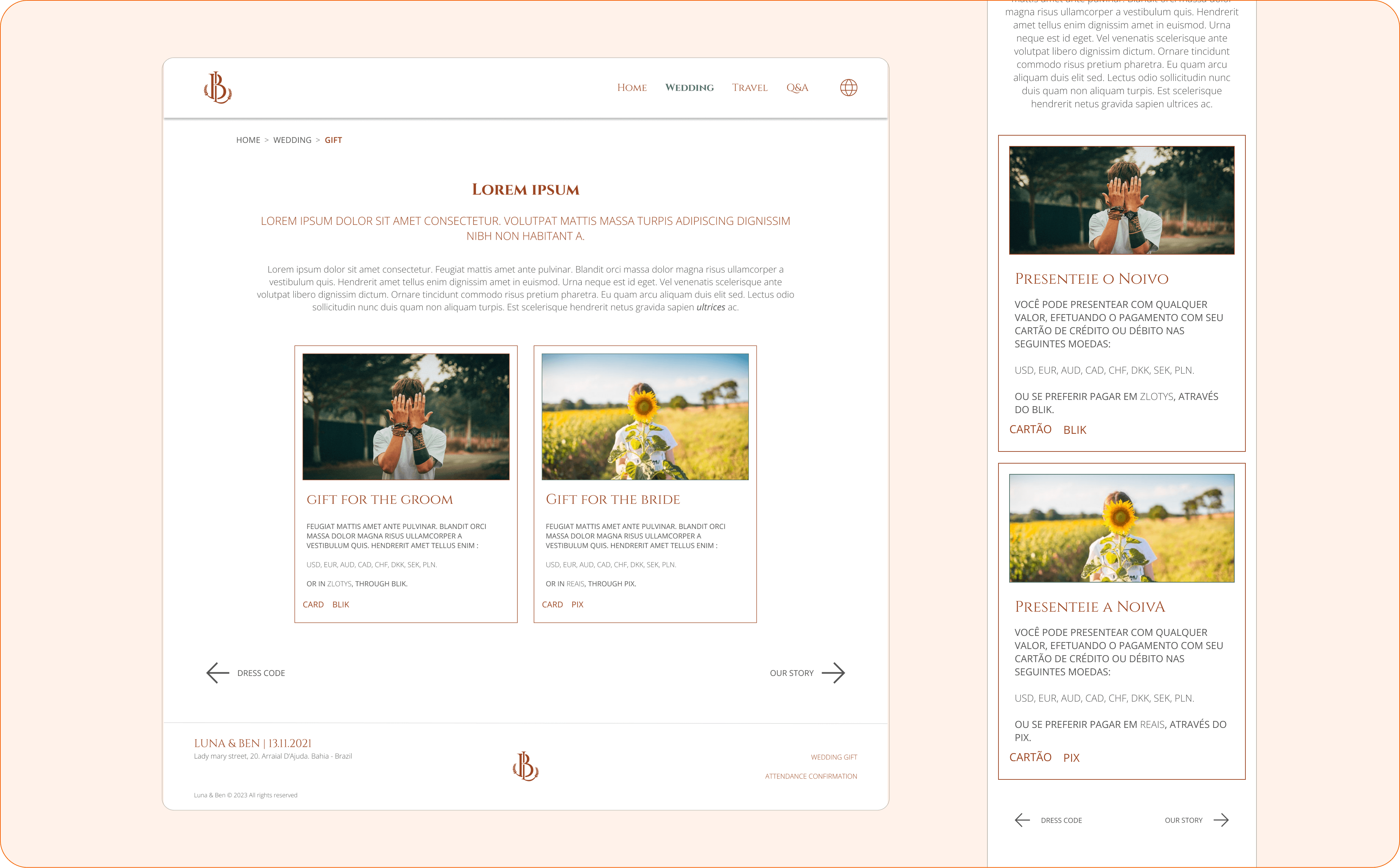
Cash gifts needed multi-currency flexibility. Commission-free giving in the guest’s own currency was essential for a destination wedding.
RSVP data had operational value beyond headcounts. Dietary needs, plus-one details, and attendance confirmations needed to reach suppliers directly.
These were the priorities:
Reduce friction for less digitally confident guests.
Centralise all information in one hub.
Make RSVPs and giving effortless regardless of language or location.
Design
Designing the system before the screens
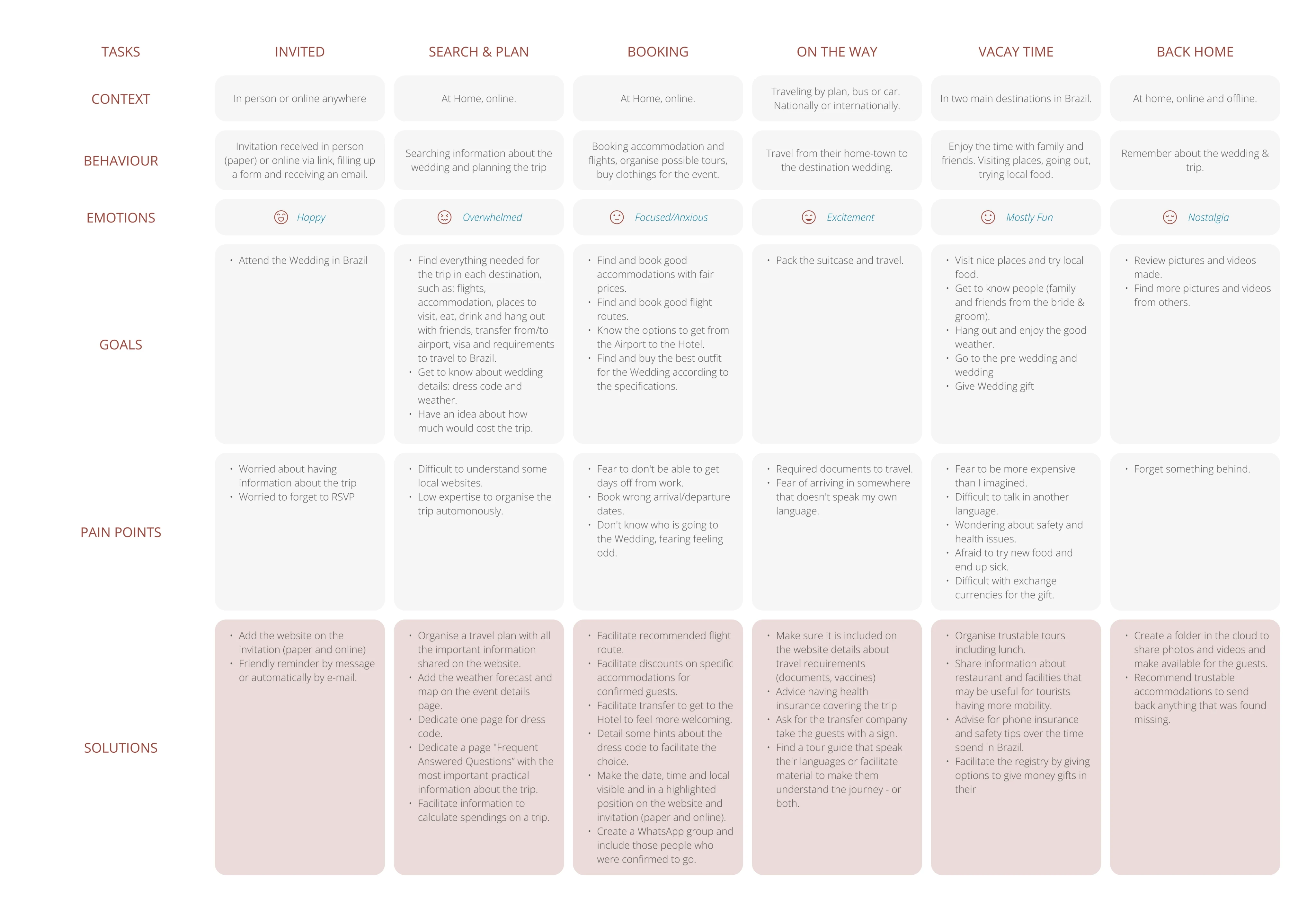
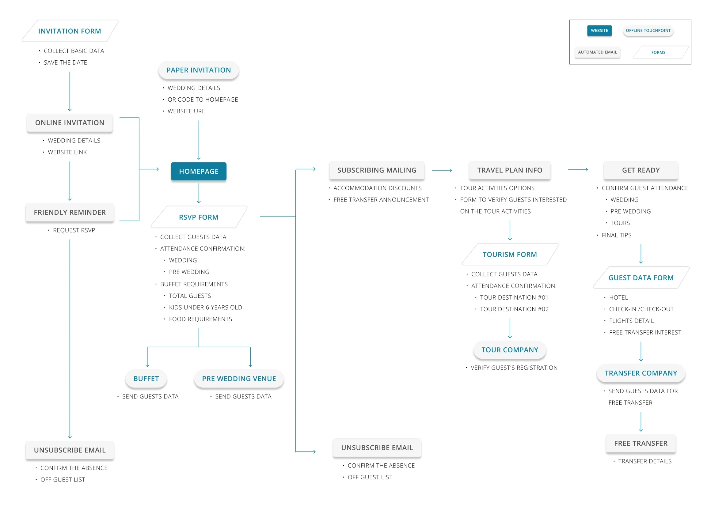
The information system positions the website as the central hub connecting guests and suppliers, automating the experience through email confirmations, content sharing, and data collection. The same RSVP data that confirmed attendance also fed into secondary event bookings, reducing manual coordination across countries and time zones.
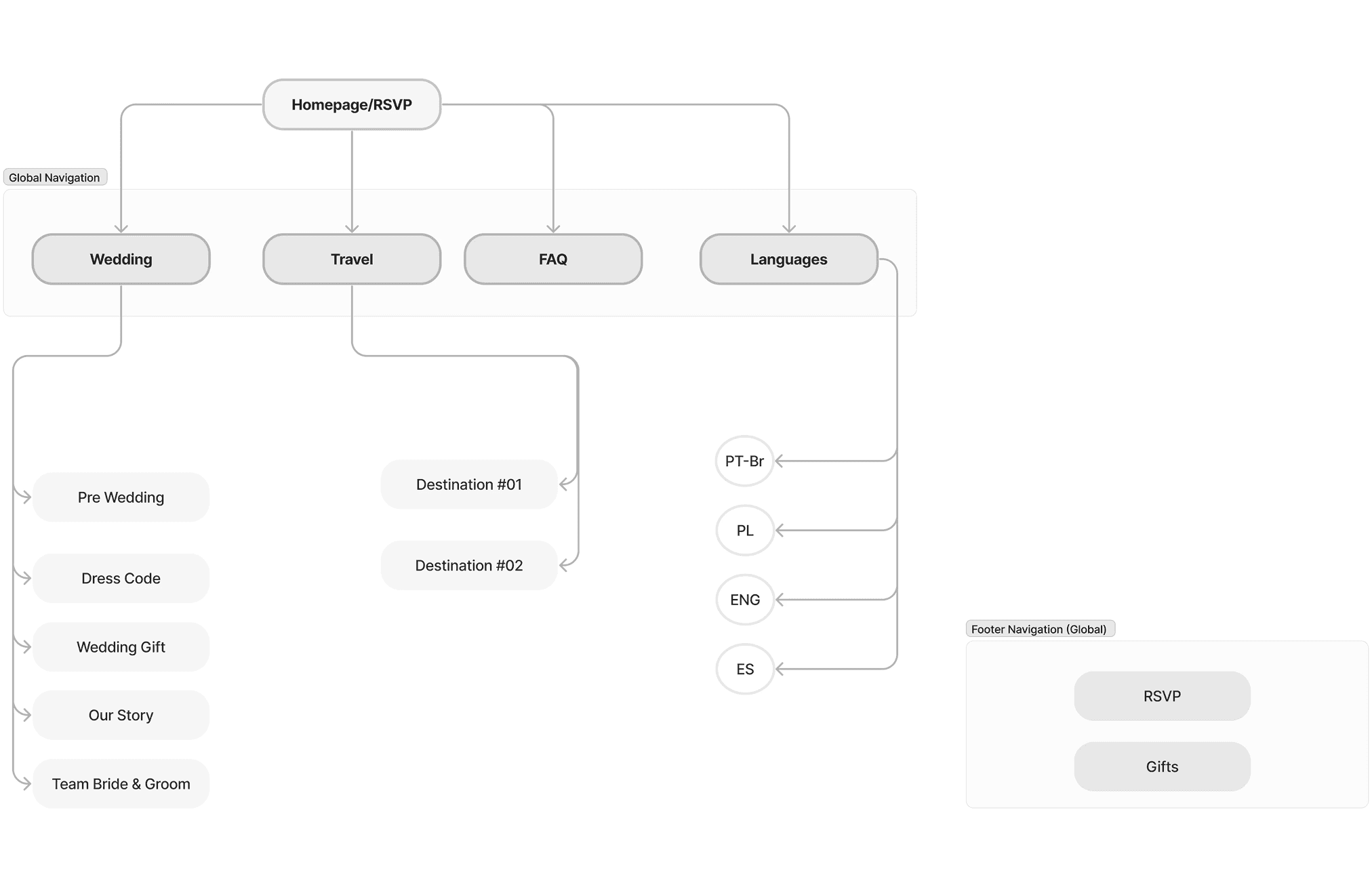
Structuring according to guest priorities
Through a card-sorting exercise with the two core audiences, I structured the site map and prioritised what guests would need first.
From brand to accessible, reusable components
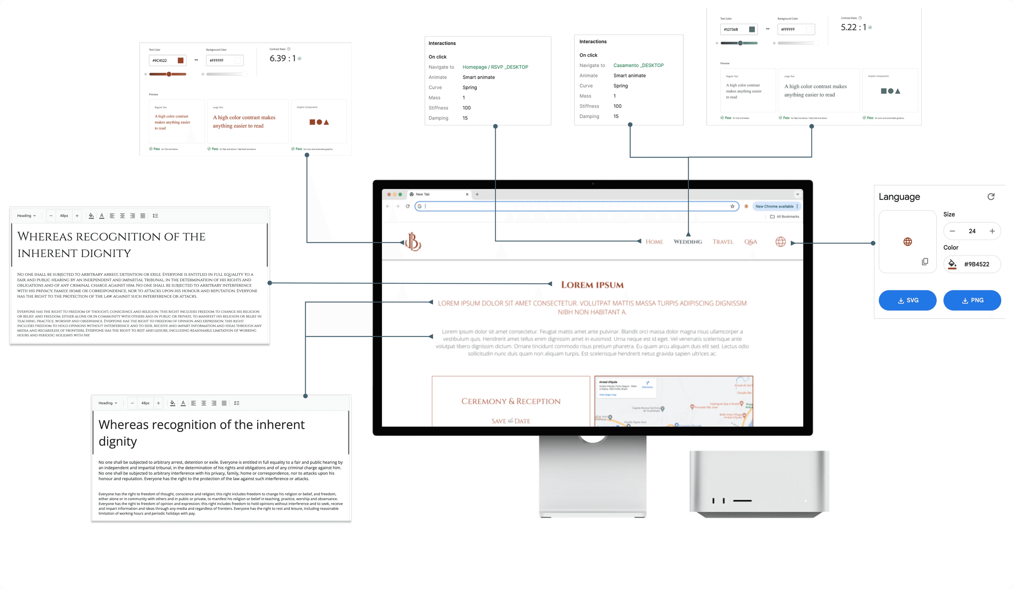
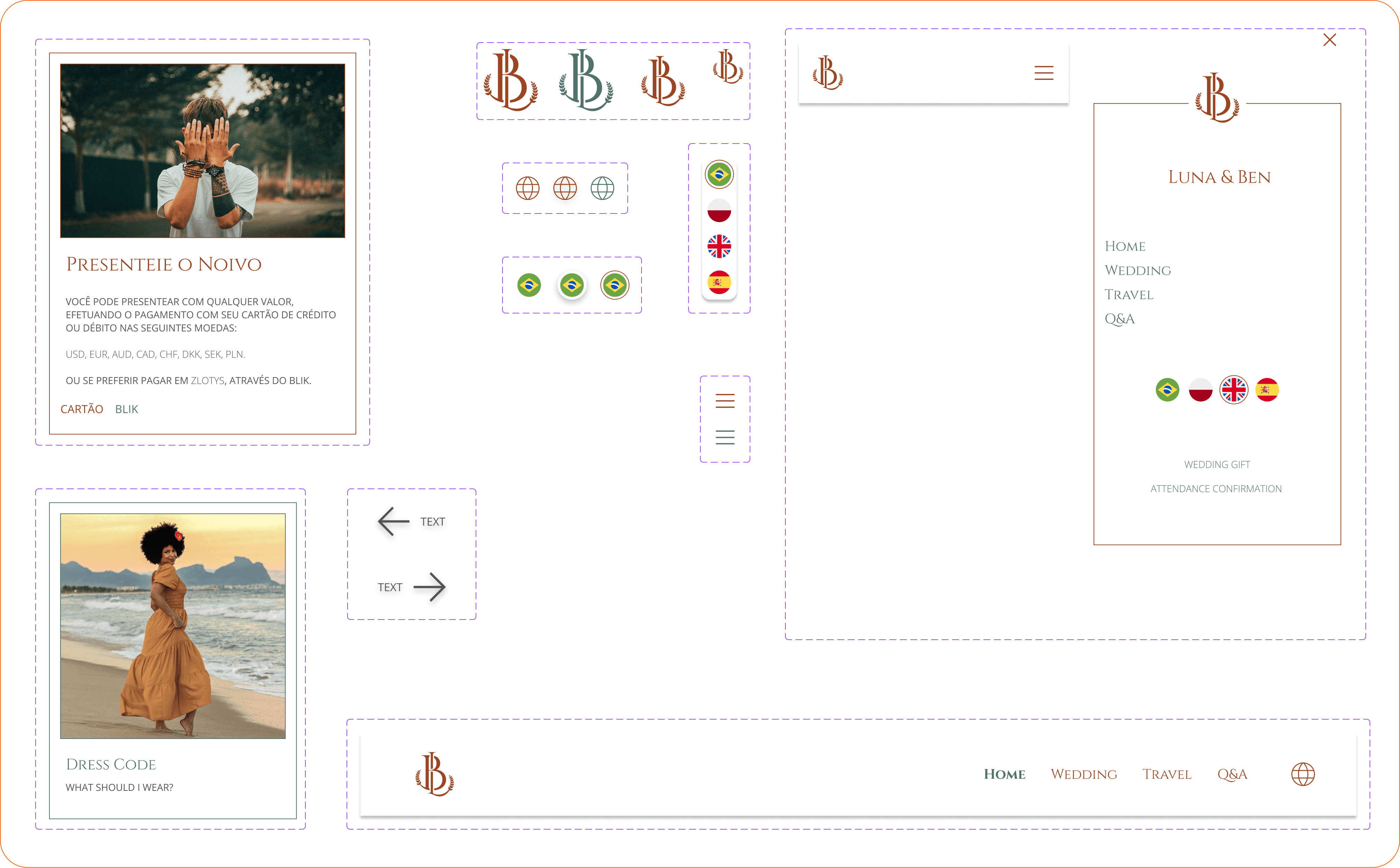
The graphic designer defined the branding assets, colour palette, and typography. I adapted the palette for WCAG-compliant contrast and responsive scaling using rem/em units. With the style guide set, I used the MUI kit as the base for all components and customised it to create a coherent, replicable structure across pages.
Aligning design with development capacity
This is the part of the project I’m proudest of, and where I learned the most at that time.
I mapped both developers’ skills and constraints against the project’s needs. With fewer than five hours weekly each, we had to prioritise ruthlessly:
React on Vercel for maintainability and cost
MUI library customised only for visual identity — 34% dev effort reduction
Mobile-first at 390px and 1024px breakpoints (tablet deprioritised)
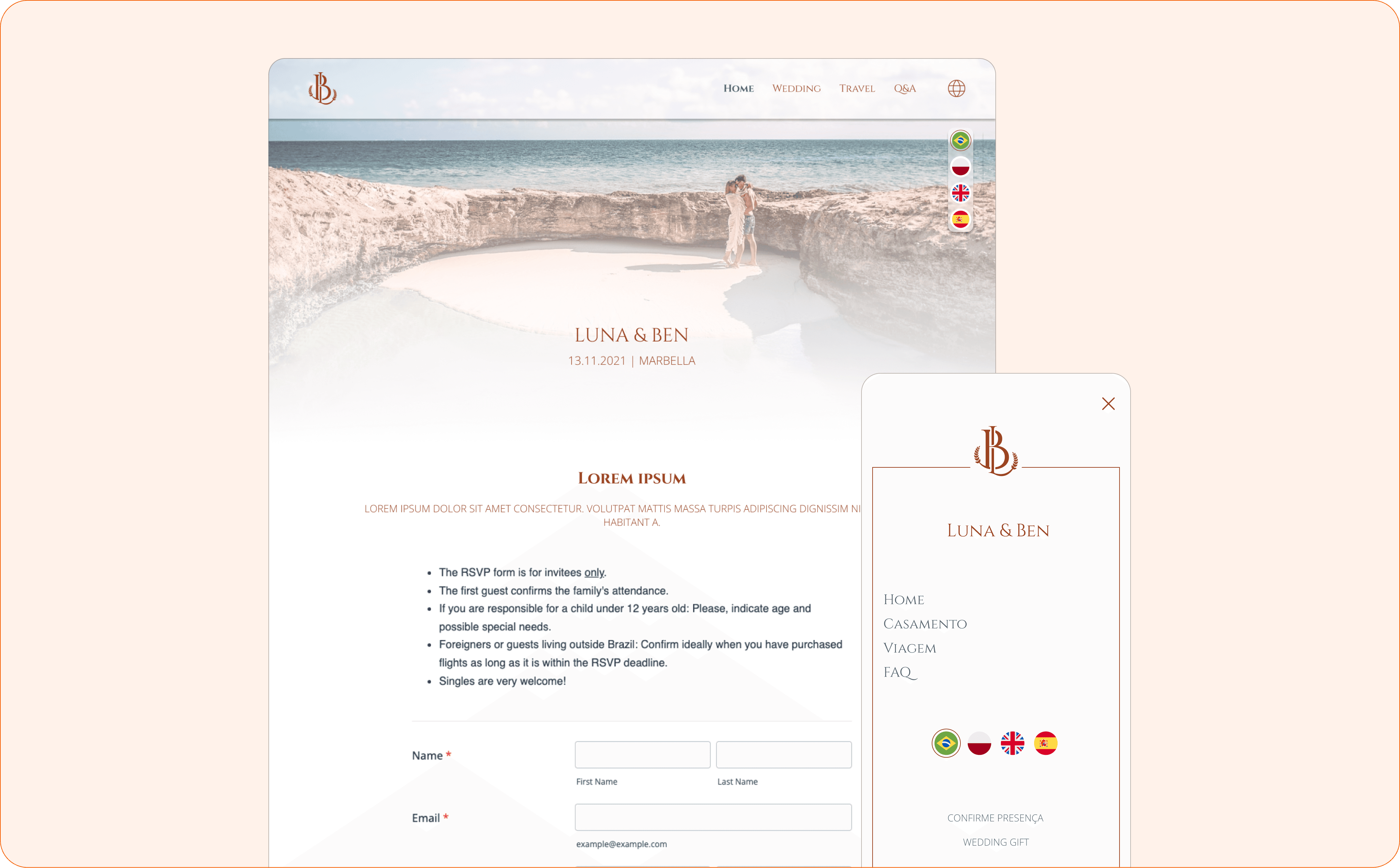
Embedded JotForm for automated RSVPs and supplier data routing
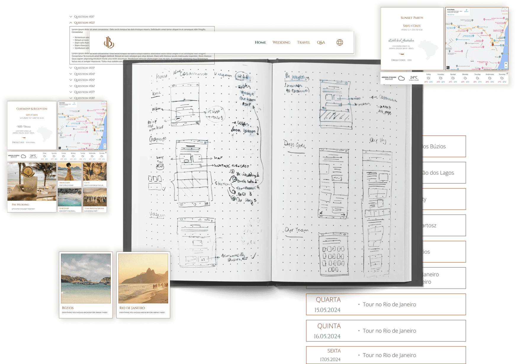
Figma with annotated comments for design guidance
I shared the full scope so each developer could estimate timelines and divide tasks according to their strengths. That meeting set clear ownership for the months ahead.
Iterating with real data
After launch, I shared the site with a small group of guests to surface issues. Google Analytics and Microsoft Clarity (screen recordings, scroll scores, heatmaps) showed what needed fixing.
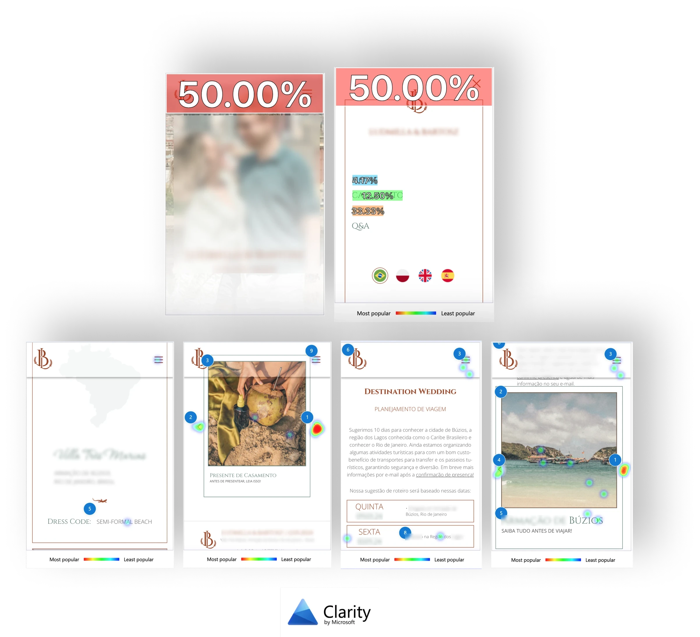
Key insights:
Form below the fold with no visual cue. I shortened the hero banner to reveal the next section, guiding users to discover the RSVP form.
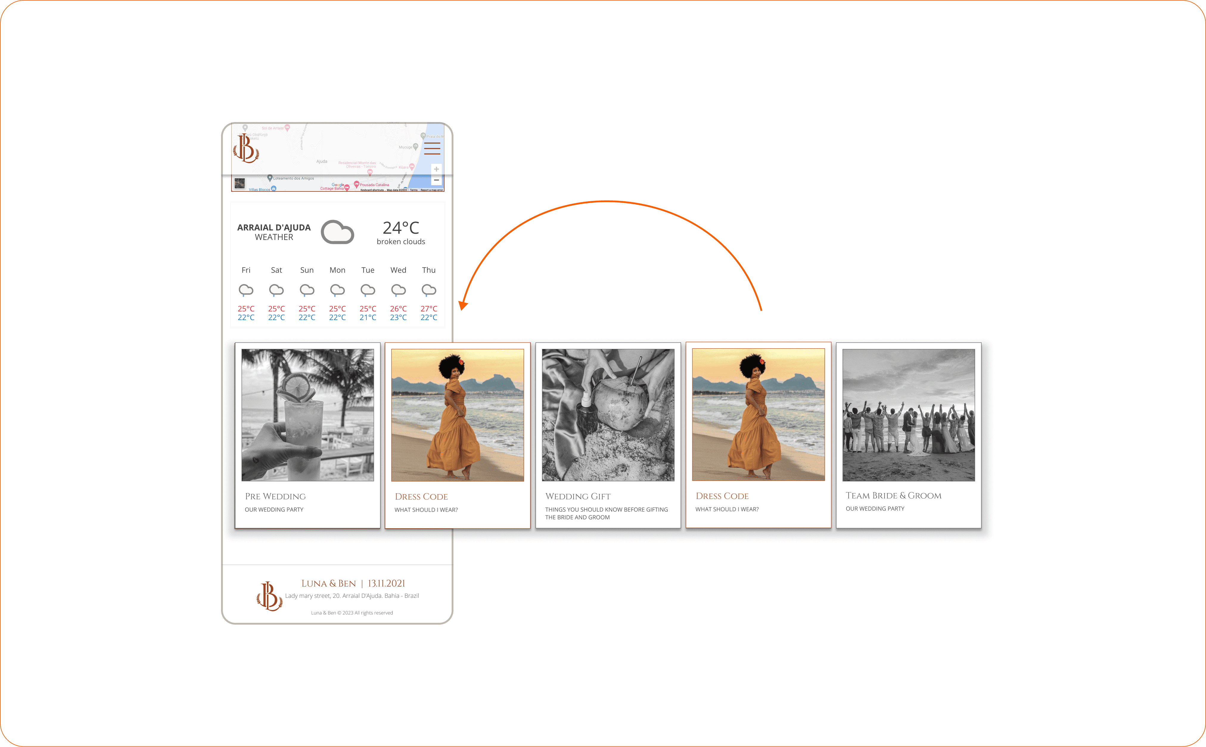
Carousel fatigue buried the dress code content. Reprioritised card order, moved dress code to second position, switched desktop to grid layout for better viewport coverage.
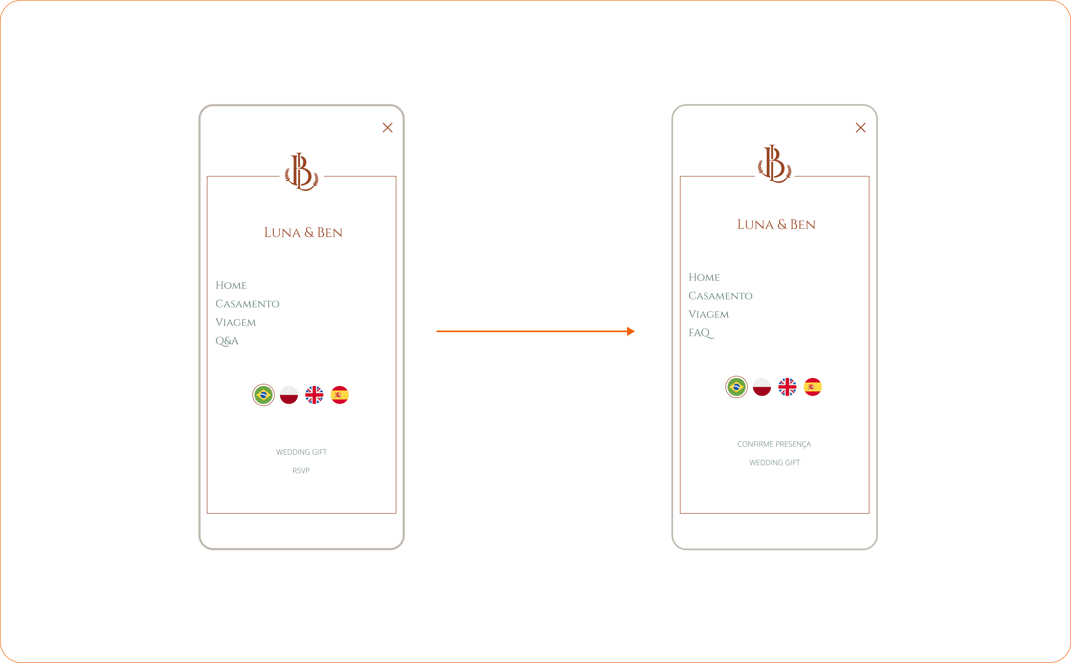
Hidden links on the mobile menu. Decreased spacing and moved the RSVP link to the first position.
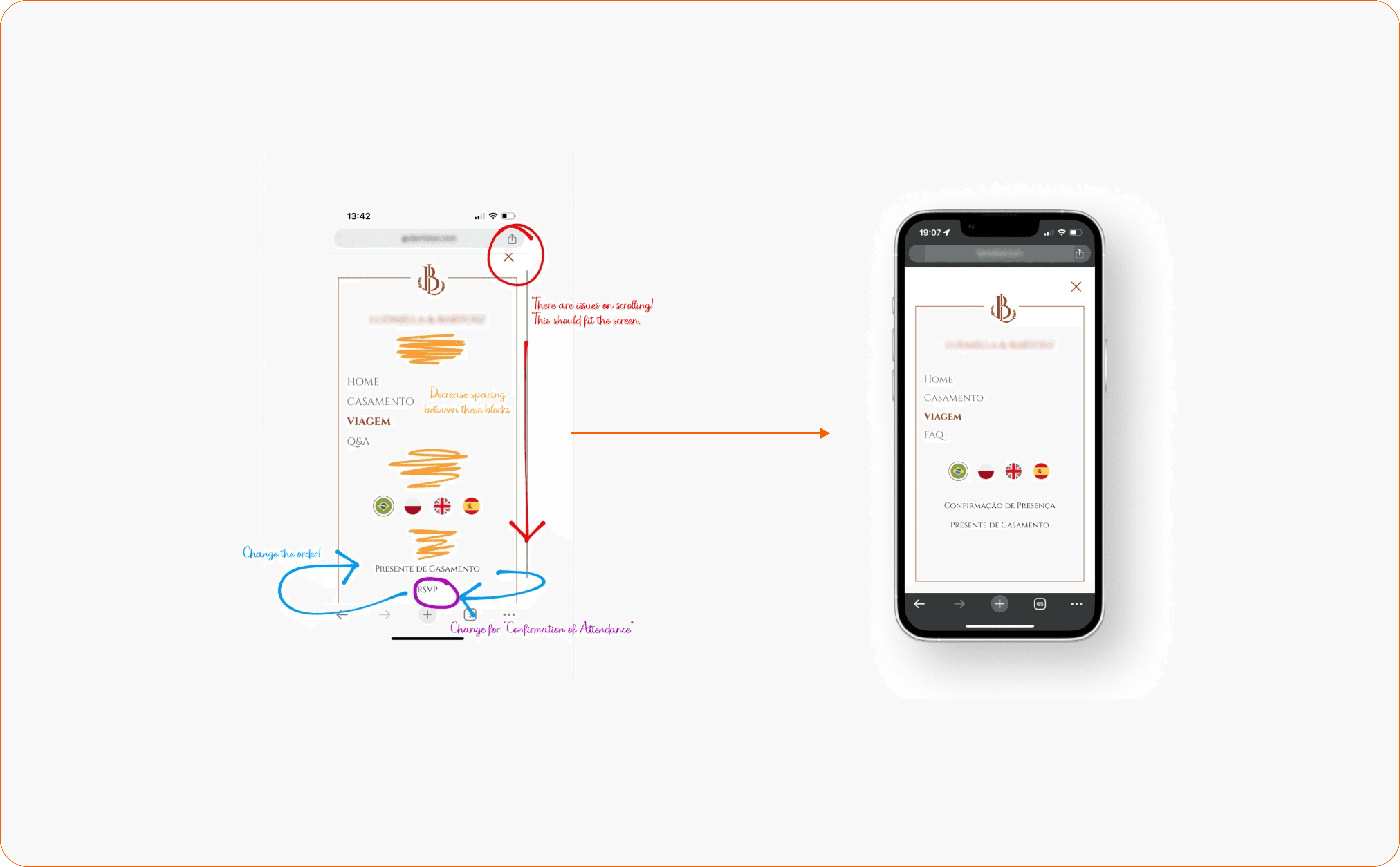
UX writing gaps across languages. English expressions confused non-English speakers. Adapted key labels (“RSVP” became “Confirm attendance”; “Q&A” became “FAQ” for Brazilian guests).
After these corrections, the site went to the remaining guests. Positive informal feedback about ease of use and finding answers without contacting the hosts.
Solution
Four-language interface with manual translations
Accessible from any page, with culturally adapted content per audience
Manual translations ensured tone and familiarity, not just accuracy
Commission-free, multi-currency cash registry
Guests transfer via Revolut or directly to local banks (Brazil or Poland)
No platform fees on any contribution
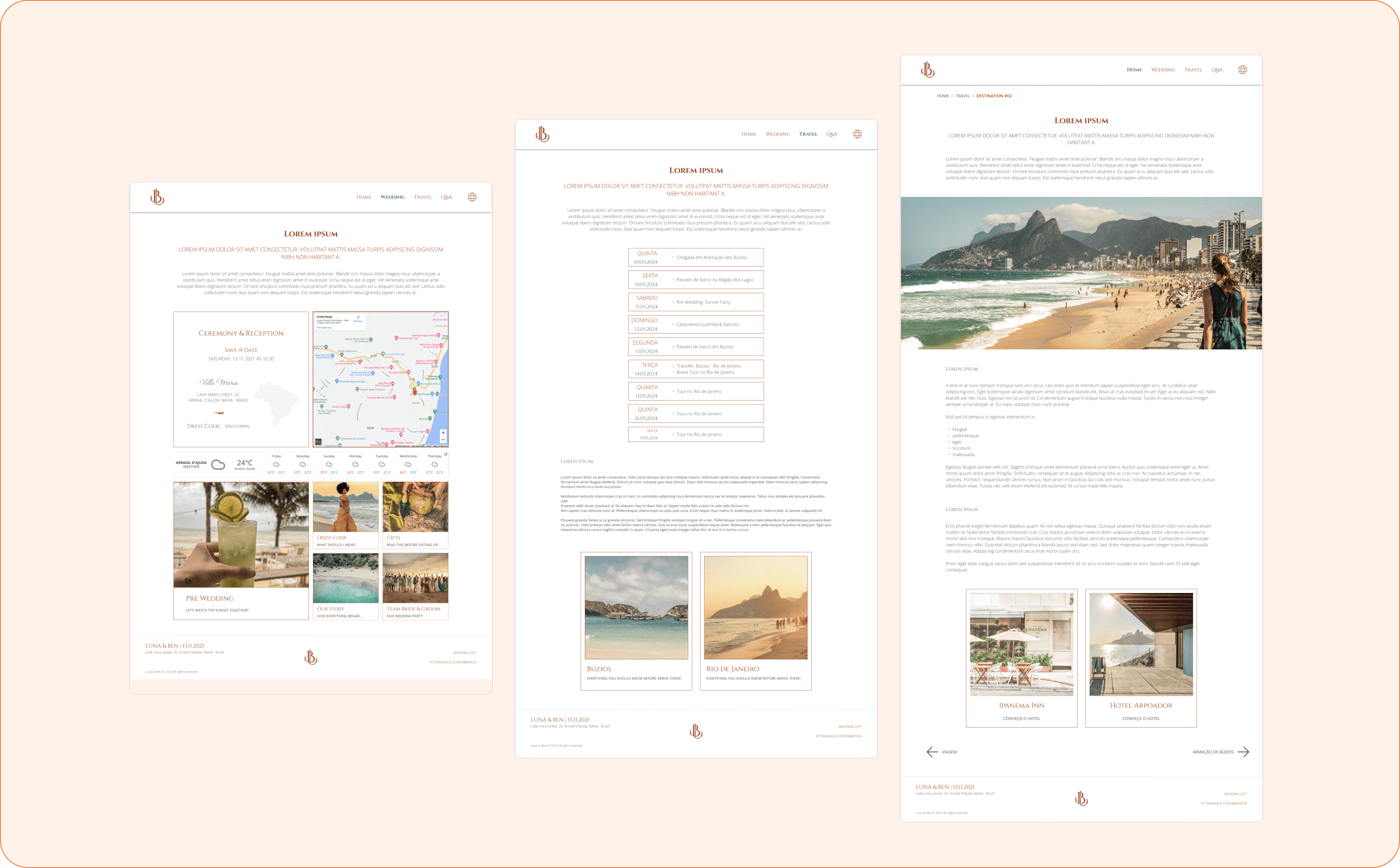
Centralised destination hub
Events, trips, and planning details in one place
RSVP data feeds directly to suppliers for catering, transport, and seating
Final Takeaway
What I carry forward
Collaboration with volunteers required more care than any document. Managing two developers with full-time jobs and limited hours meant understanding their needs, skills, and limits before anything else — and we still shipped on time.
Product-led thinking shaped every prioritisation decision. Treating this as a temporary MVP forced me to focus on essential features and use data to guide what really mattered to change.
Post-launch data closed the feedback loop. Screen recordings and heatmaps turned assumptions into evidence, and every design fix was triggered by real user behaviour.
What I'd do differently
Differentiate clickable from non-clickable components on mobile. Visual coherence across components meant I missed signalling interaction states clearly on mobile — the iteration data caught it, and I take this learning into every project since.
Worry less about automation in a personal context. In B2B SaaS, self-service saves time, reduces costs and potentializes adoption. In a personal context, many guests craved warmer conversations and ultimately confirmed their attendance without the form.
Revisit the manual translation approach. Manual translation ensured cultural accuracy, but AI-assisted tools have matured — I’d now use them to accelerate, keeping human review for cultural nuance.