Discovery & Ideation
Briefing for concept directions
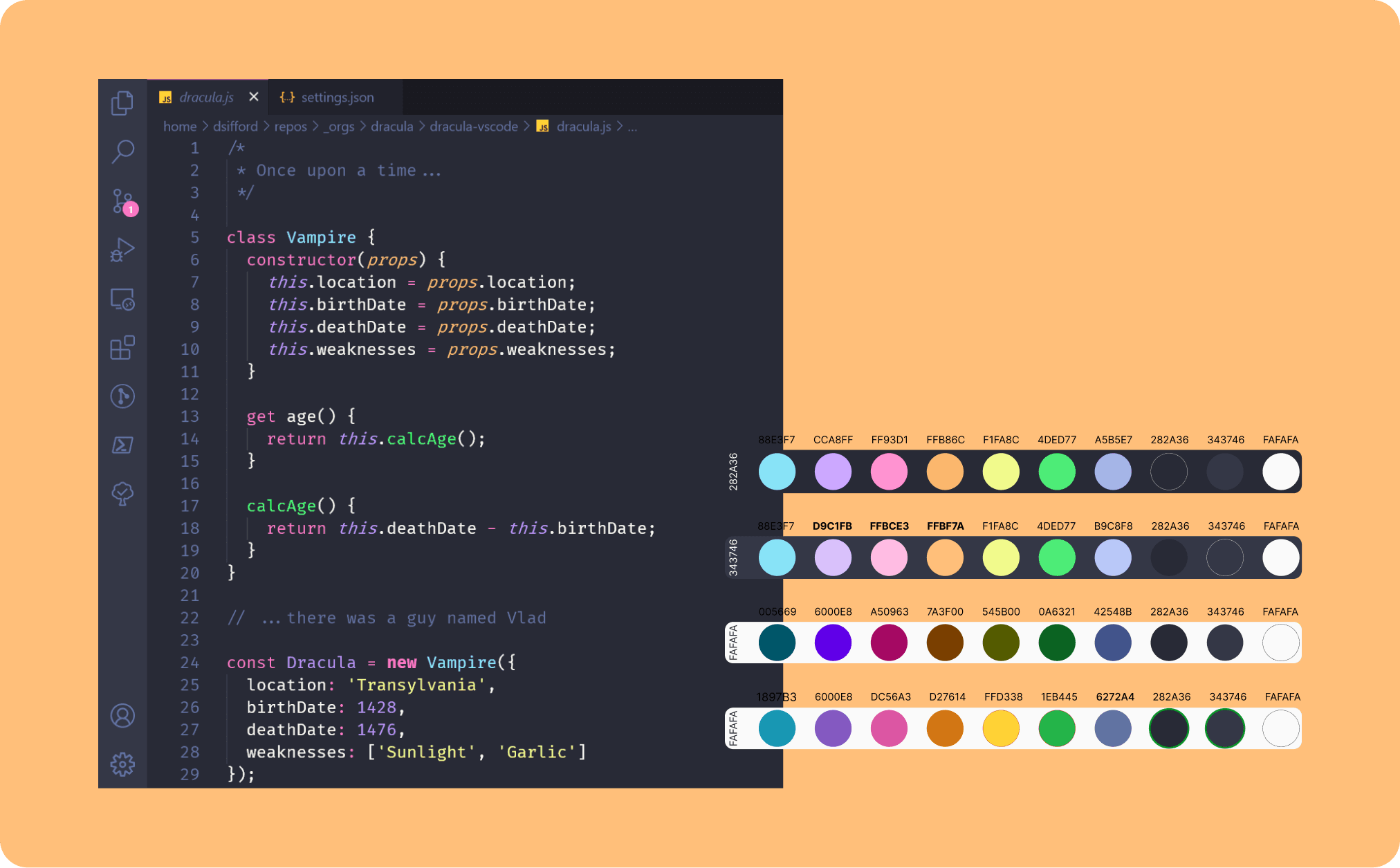
I ran a briefing session to map Daniel’s professional profile, personality traits, and visual preferences, which led him to suggest the Dracula VS Code theme as a starting point.
Key findings:
Developer culture alignment matters. Using a visual reference the target audience instantly recognises creates familiarity and credibility from the first second.
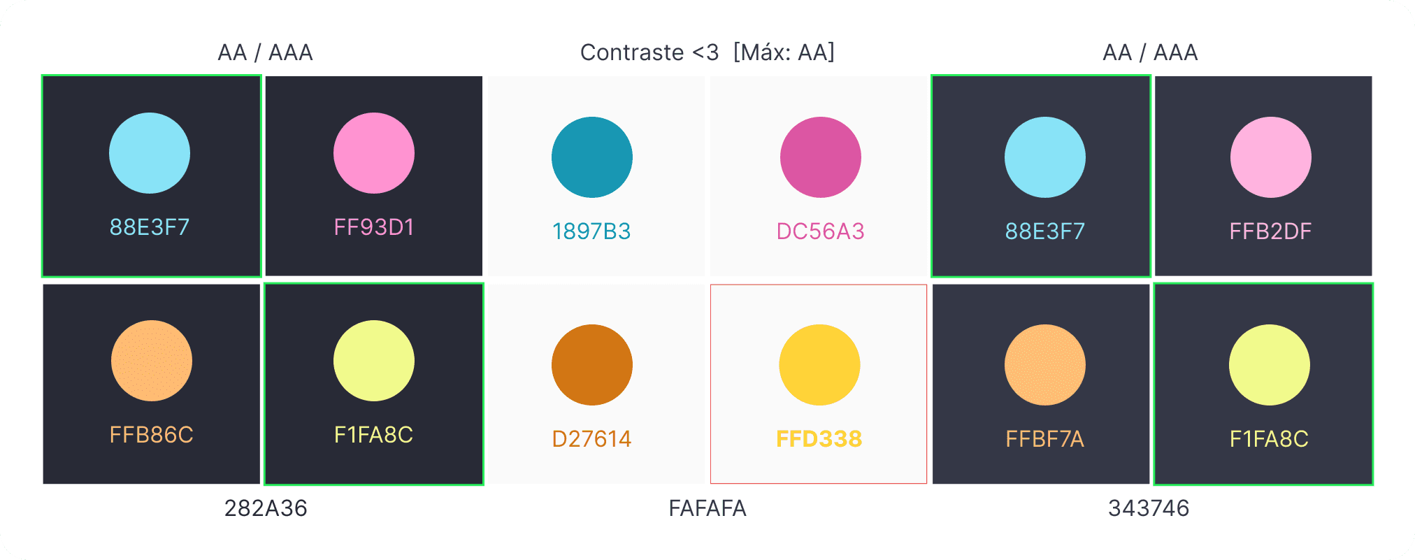
Accessibility corrections were non-negotiable. Several Dracula palette colours failed WCAG AA contrast thresholds. The palette needed correction without losing its identity.
The brand should feel alive, not static. Daniel’s personality traits pointed toward dynamic interactions and animated elements rather than a rigid look.
Design
From VS Code to WCAG colour system
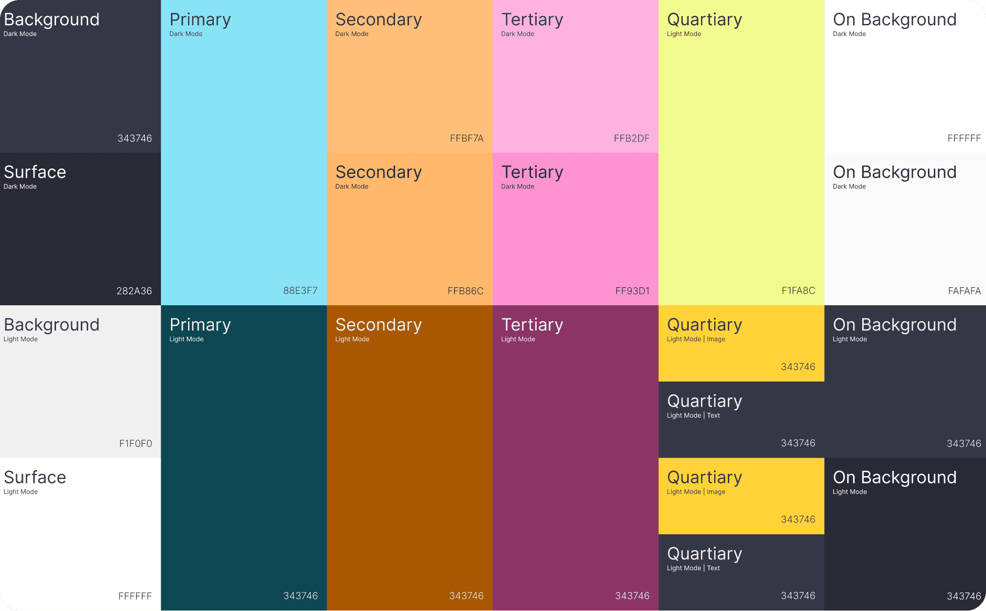
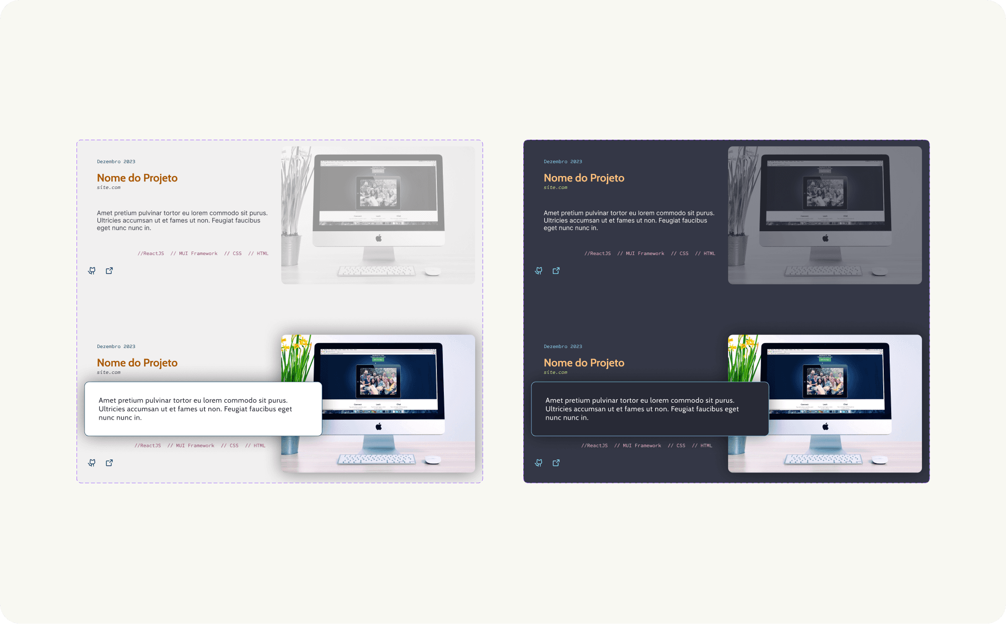
I extracted core colours from the Dracula VS Code theme and selected the ones that best represented Daniel’s brand using colour psychology principles. I mapped these across dark and light backgrounds, then tested every pairing against WCAG contrast requirements. Non-compliant colours were adjusted while preserving their hue identity.
Tying the visual language together
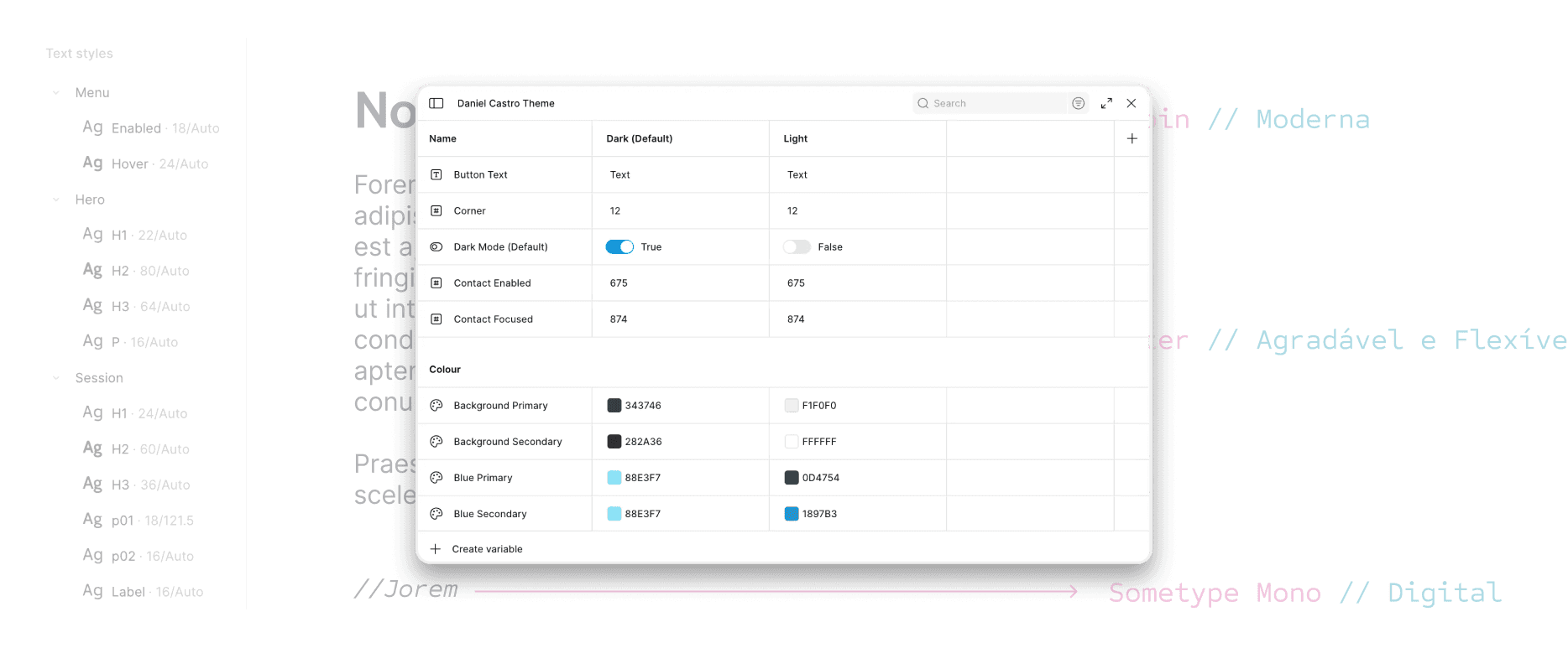
I defined the visual standards for the entire project: typography, colour palette, spacing, grid, and effects. This includes text styles, effect styles, and layout guidelines for desktop.
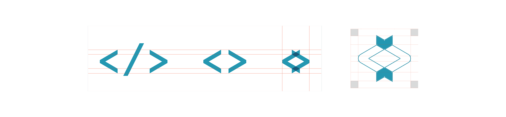
A logo anchored in code culture
I merged overlapping code symbols (</>, <>) into two converging arrows — communicating focus and movement while anchoring the brand in programming culture.
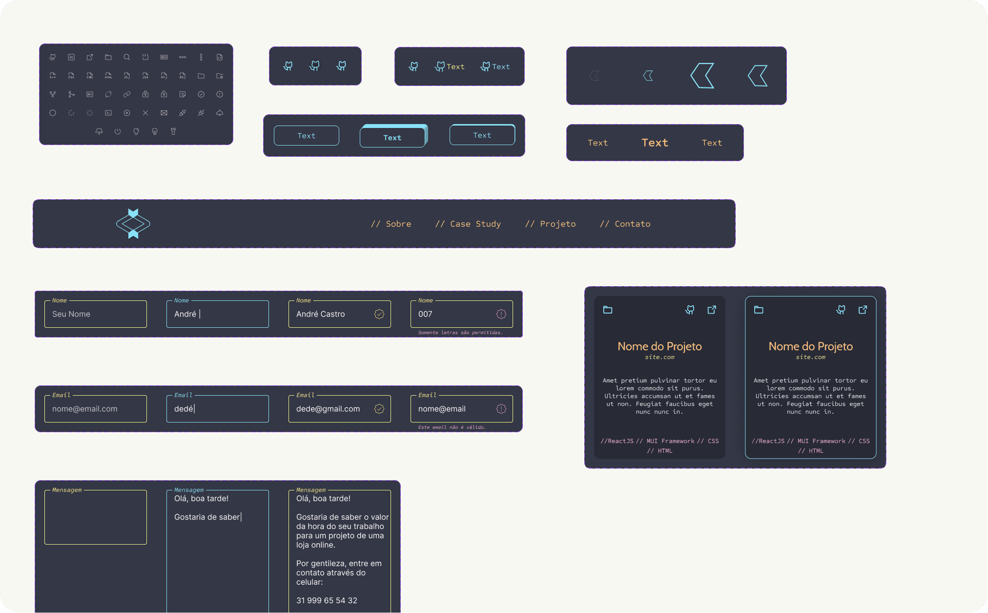
Composing the landing page from reusable parts
I designed the landing page using an atomic design framework, composing content modules (project cards, profile sections, form elements) and assembling them into full session layouts. This modular approach could speed up the development process.
Solution
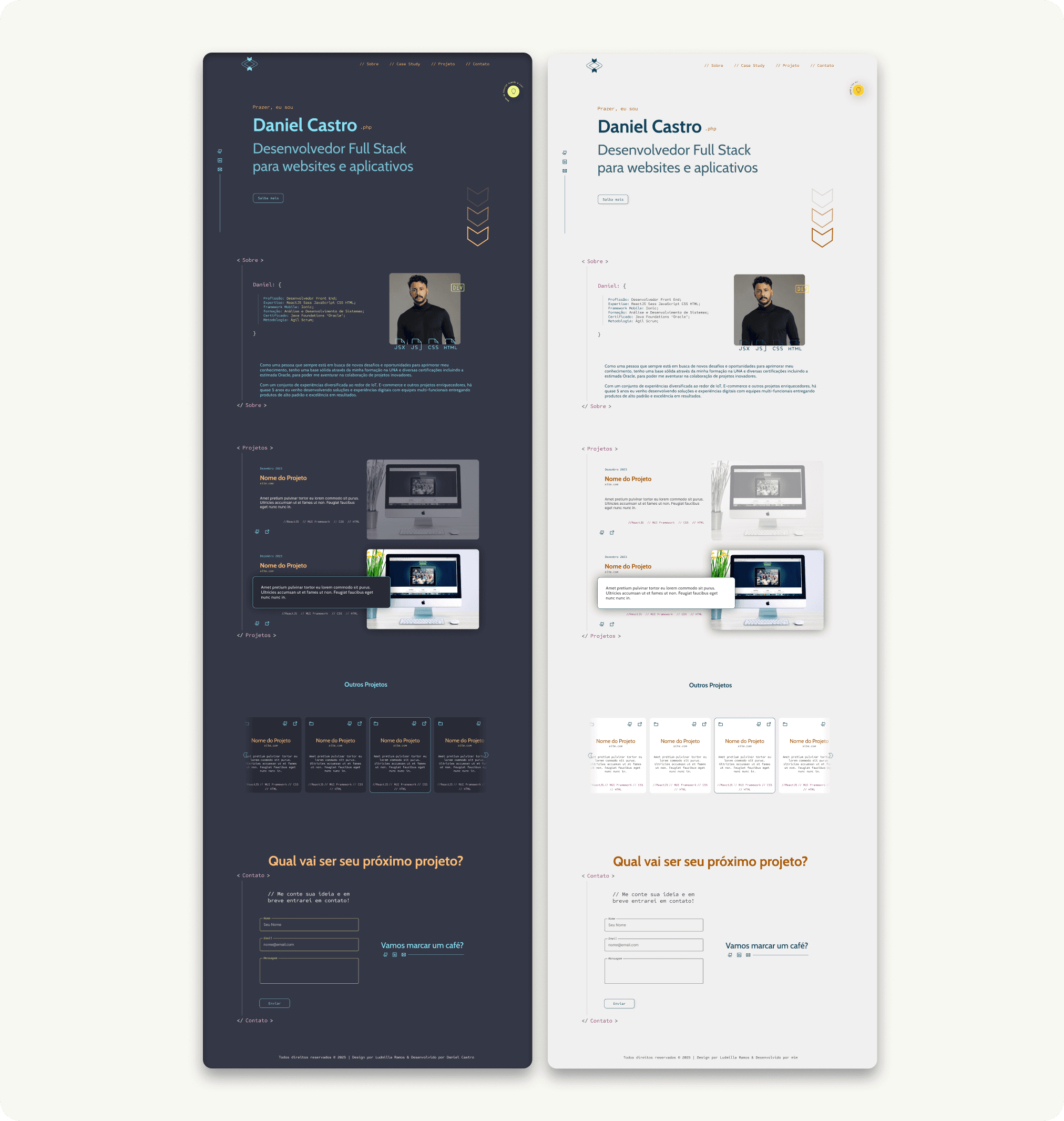
Accessible in 2 modes, authentic portfolio
The final portfolio addressed all three problems from the brief.
Visual identity for hiring managers, developers and engineers. Translates Daniel’s personality and profession into a language his audience reads instantly.
WCAG colour system as a permanent reference. An accessible palette he can use for every future design decision without external support.
Intuitive content structure. Visitors navigate projects, skills, and contact information effortlessly.
Final Takeaway
Key positive outputs
Restrained palette, faster process. Fewer colours reduced cognitive overload and sped up every design decision.
Interactive assets that communicate personality. The animated logo and section transitions guide visitors while expressing Daniel’s energy.
WCAG compliance with long-term value. Accessibility corrections will positively affect the website’s performance and credibility over time.
My personal recommendations
Add a content management layer. A simple CMS would let Daniel update his portfolio without changing code, lowering the maintenance barrier.
Lead users with projects above the fold. Moving “About” below featured projects would show competence faster, since visitors need an average of 7.2s to find value.
Consider a multipage structure. Separate pages would reduce scrolling fatigue and give each section room to breathe.


